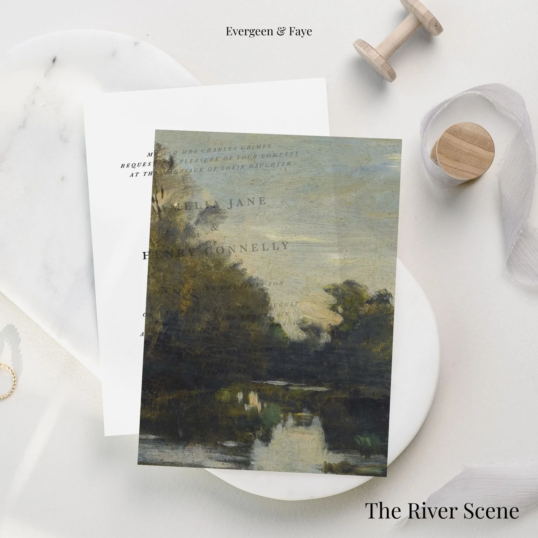
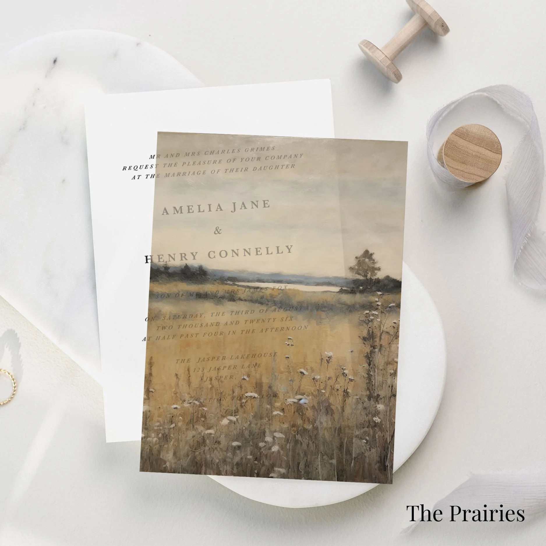
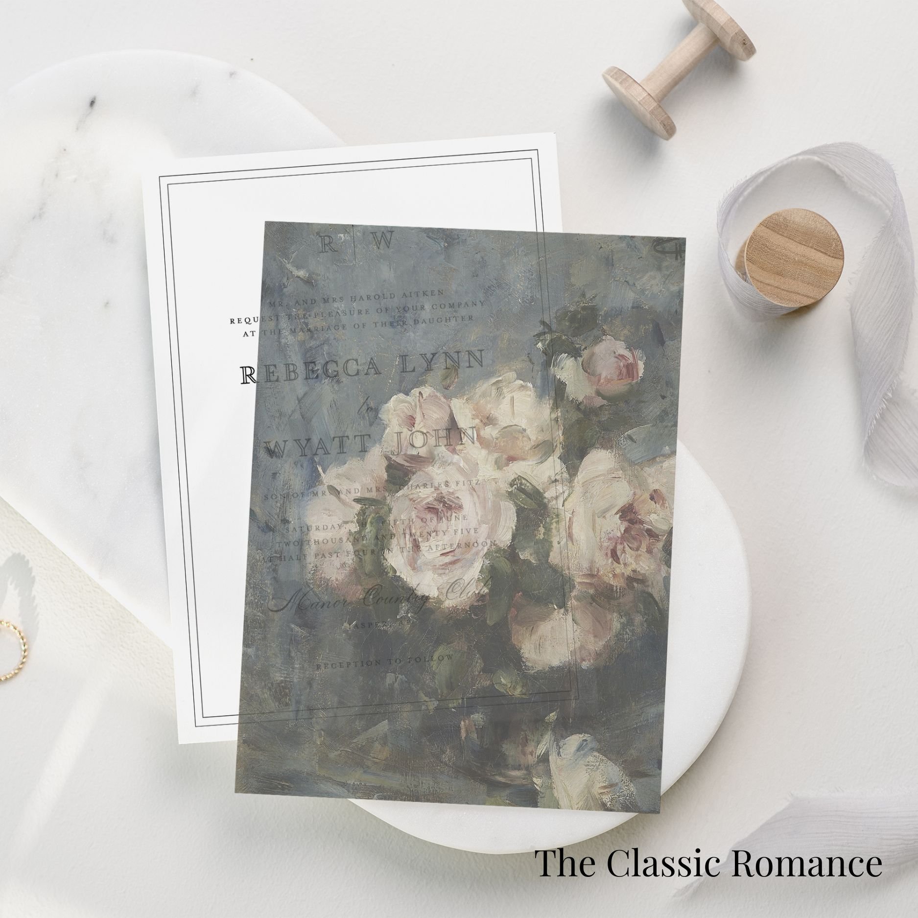
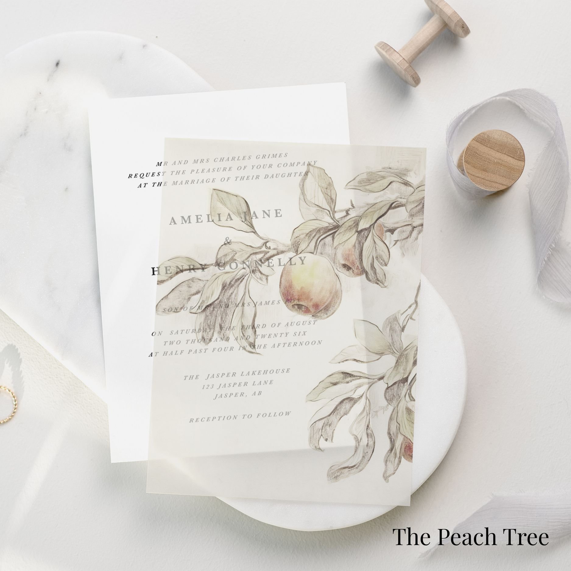
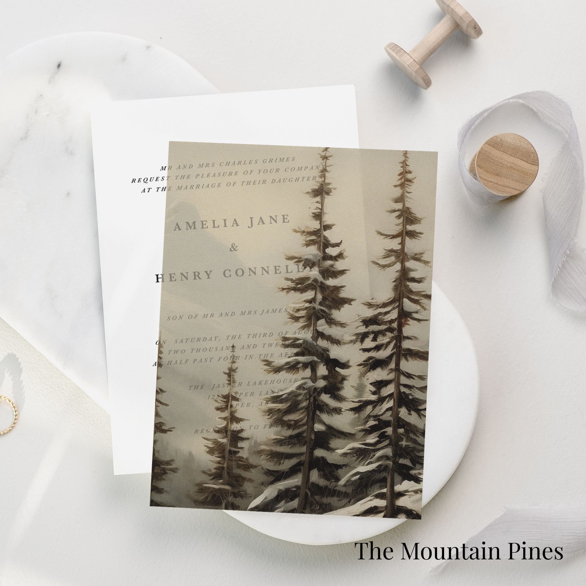
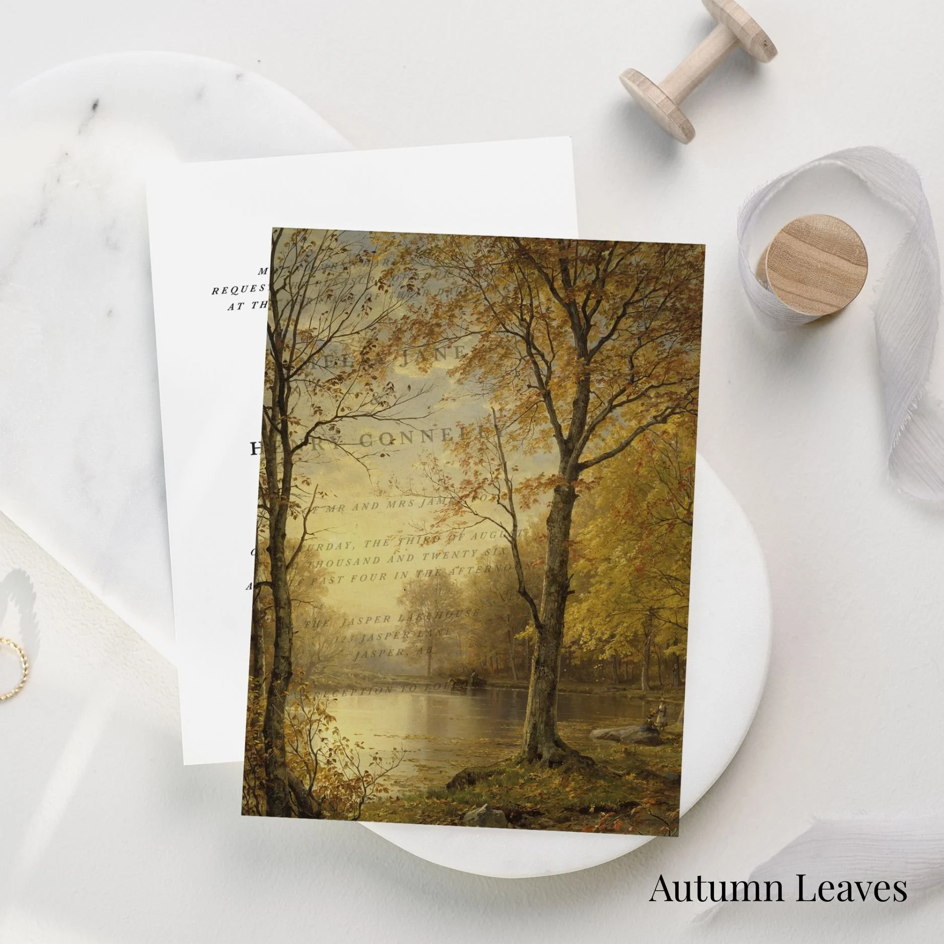
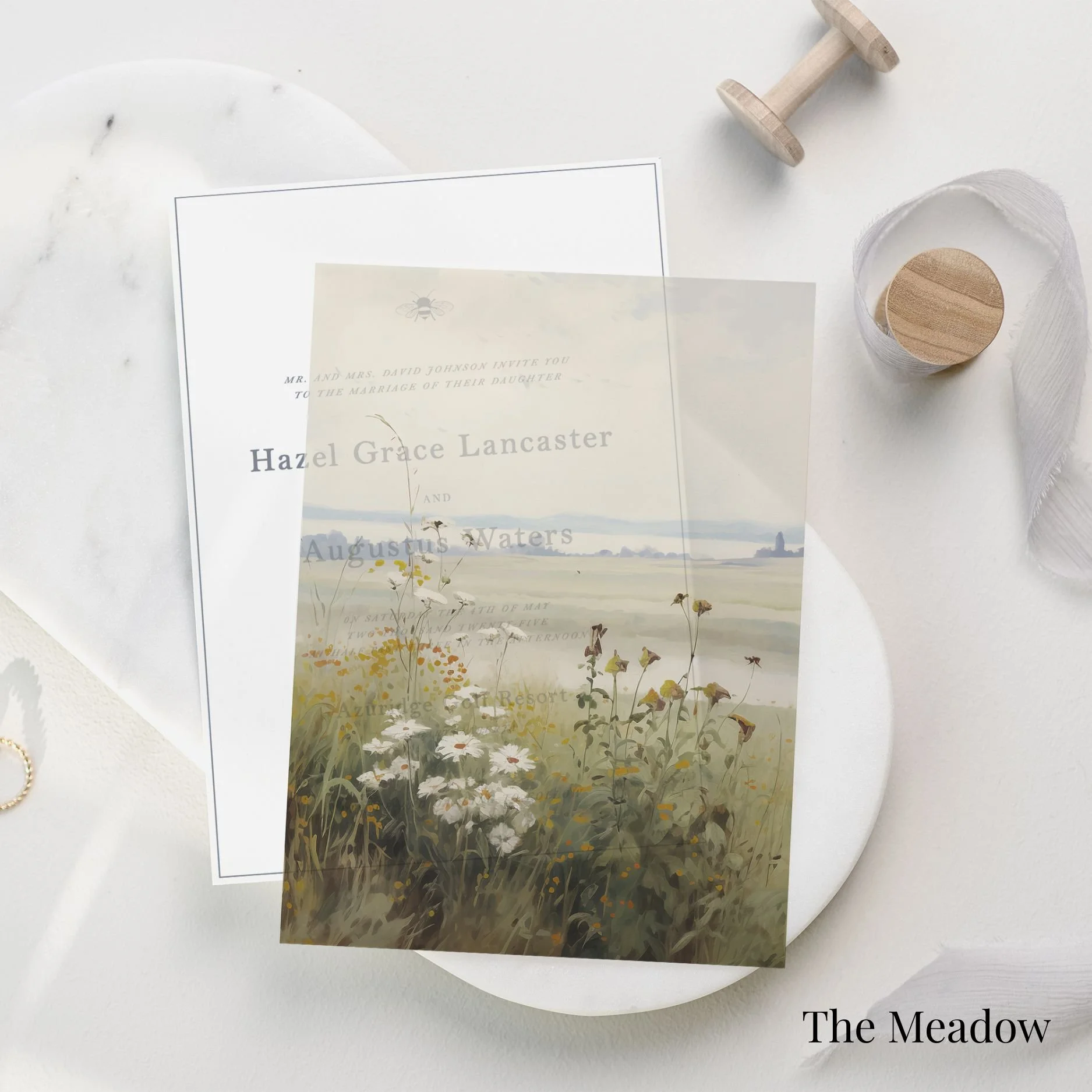
the collection guide
Our semi-custom collection is designed for couples who love the ease of an established design, but still want their wedding stationery to feel personal, intentional, and beautifully considered.
Each suite begins with one of our signature layouts, then is tailored with your wedding details, wording, paper selection, print method, and colour palette. The result is a thoughtfully customized invitation suite that feels elevated, cohesive, and entirely yours.
This guide outlines the paper, printing, and colour options available within the semi-custom collection so you can choose the details that best reflect the tone of your day.
Cards & sizing
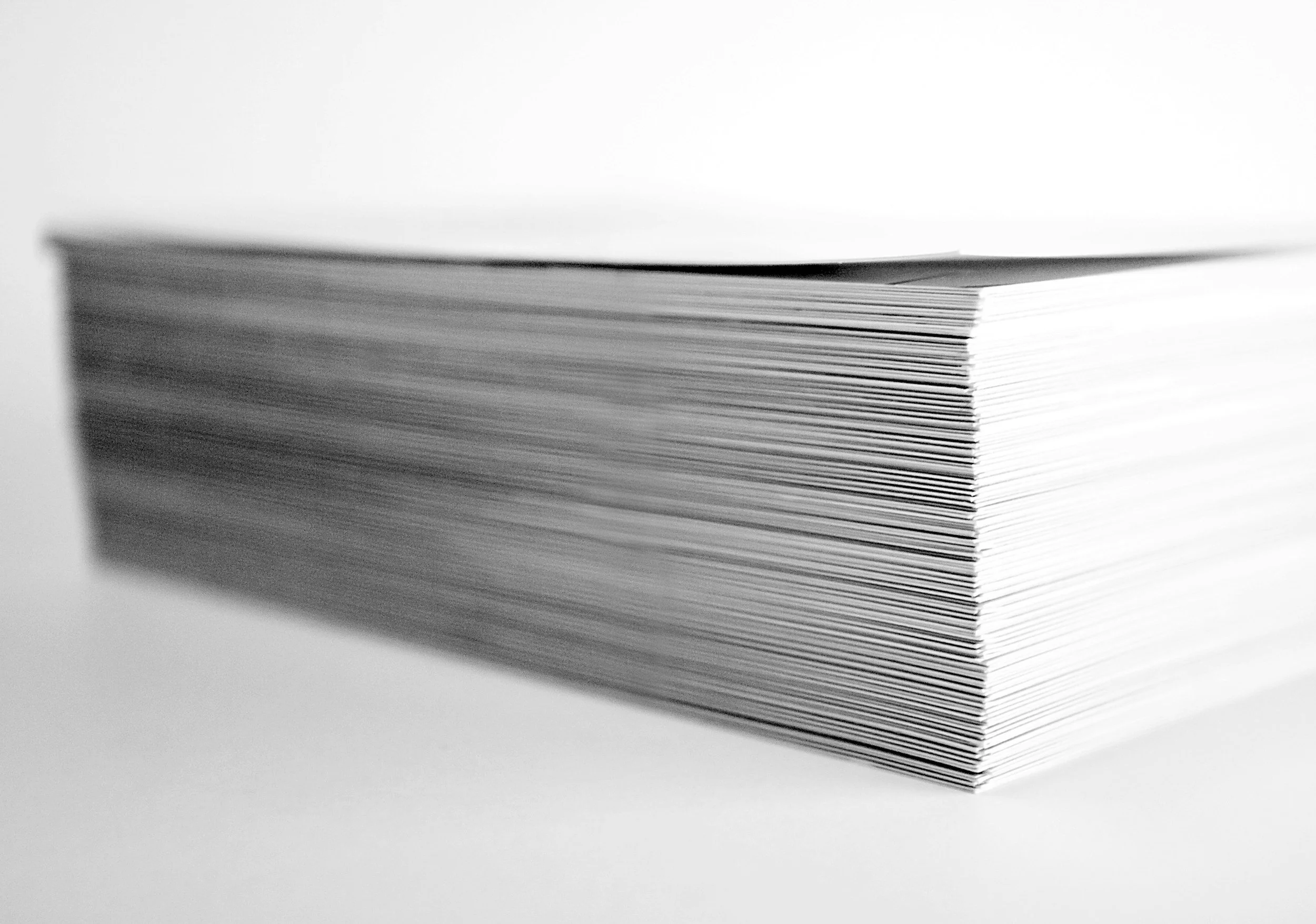
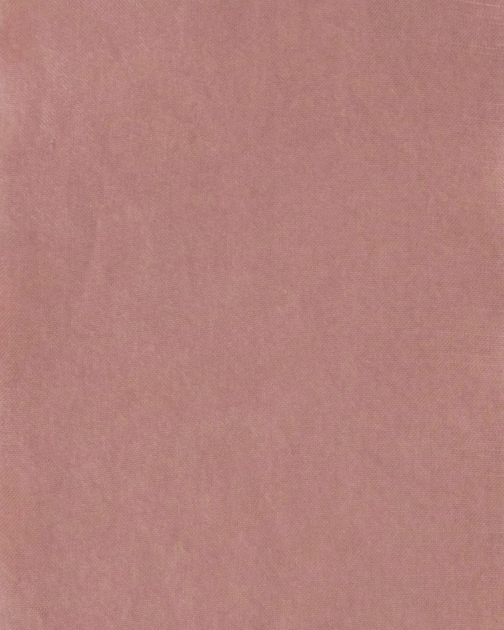
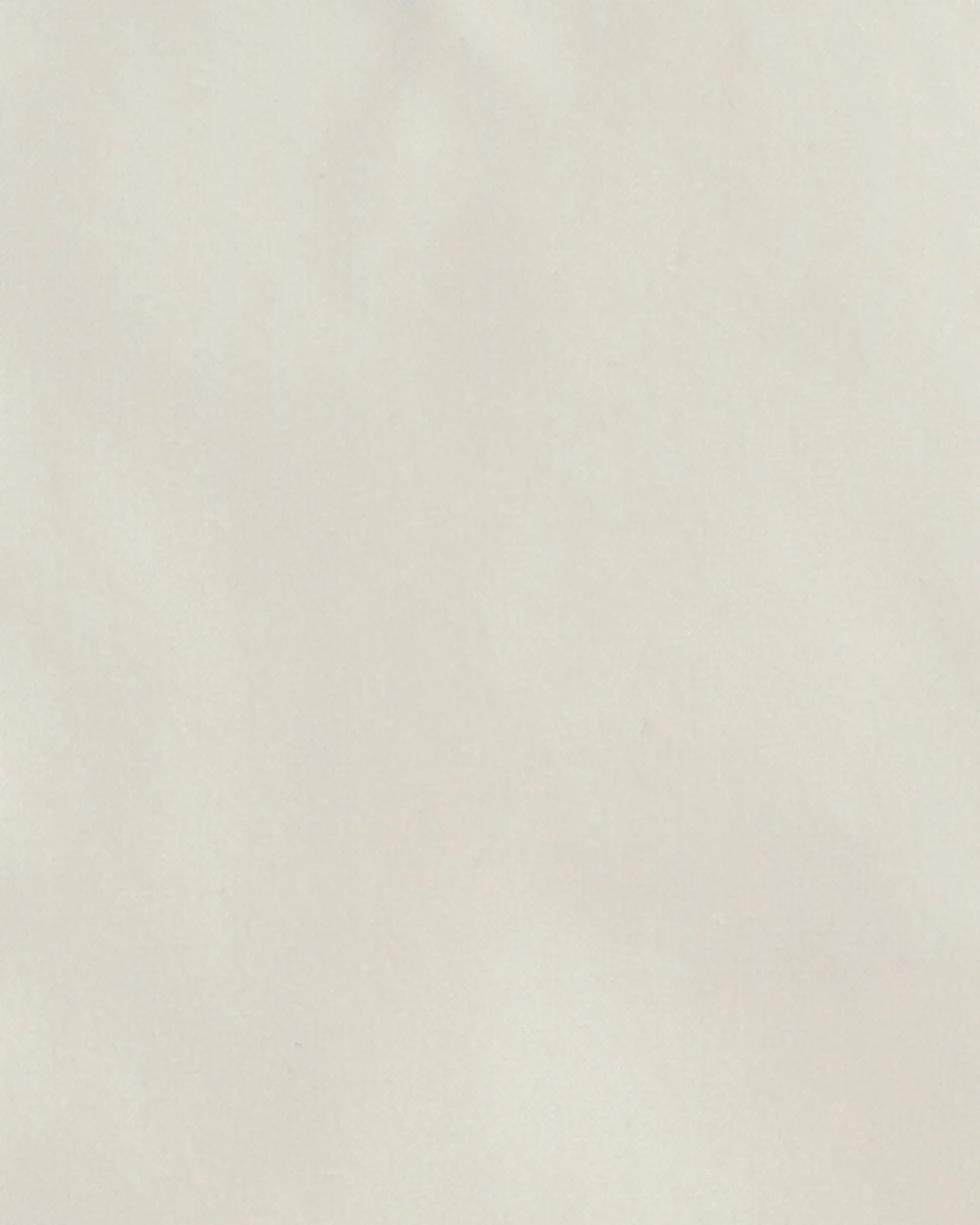
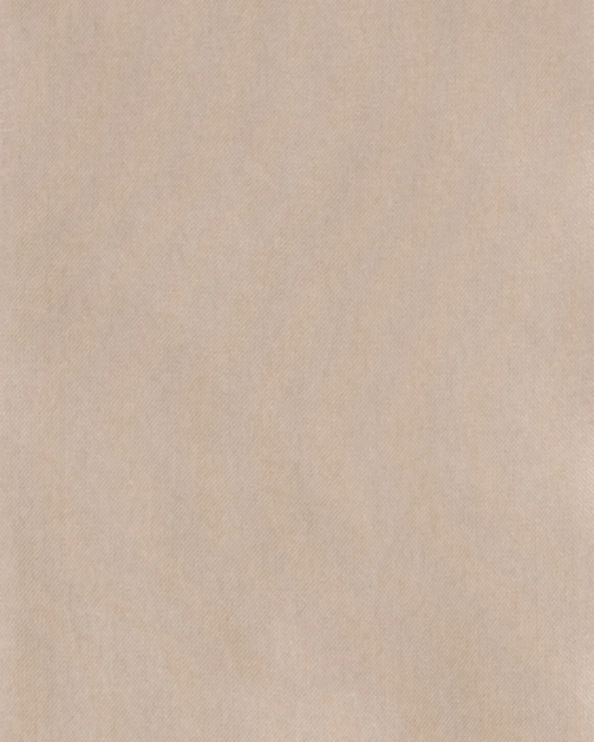
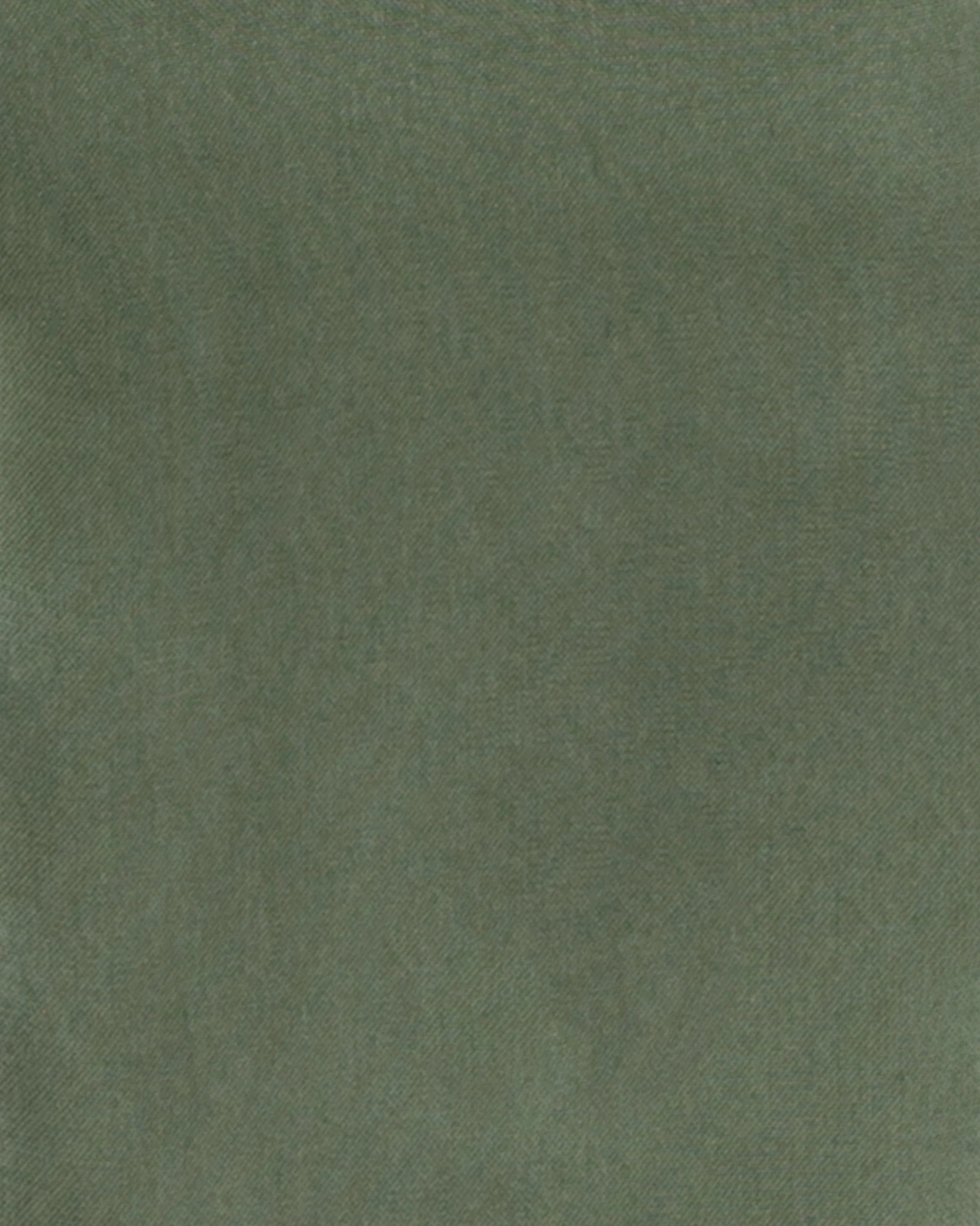
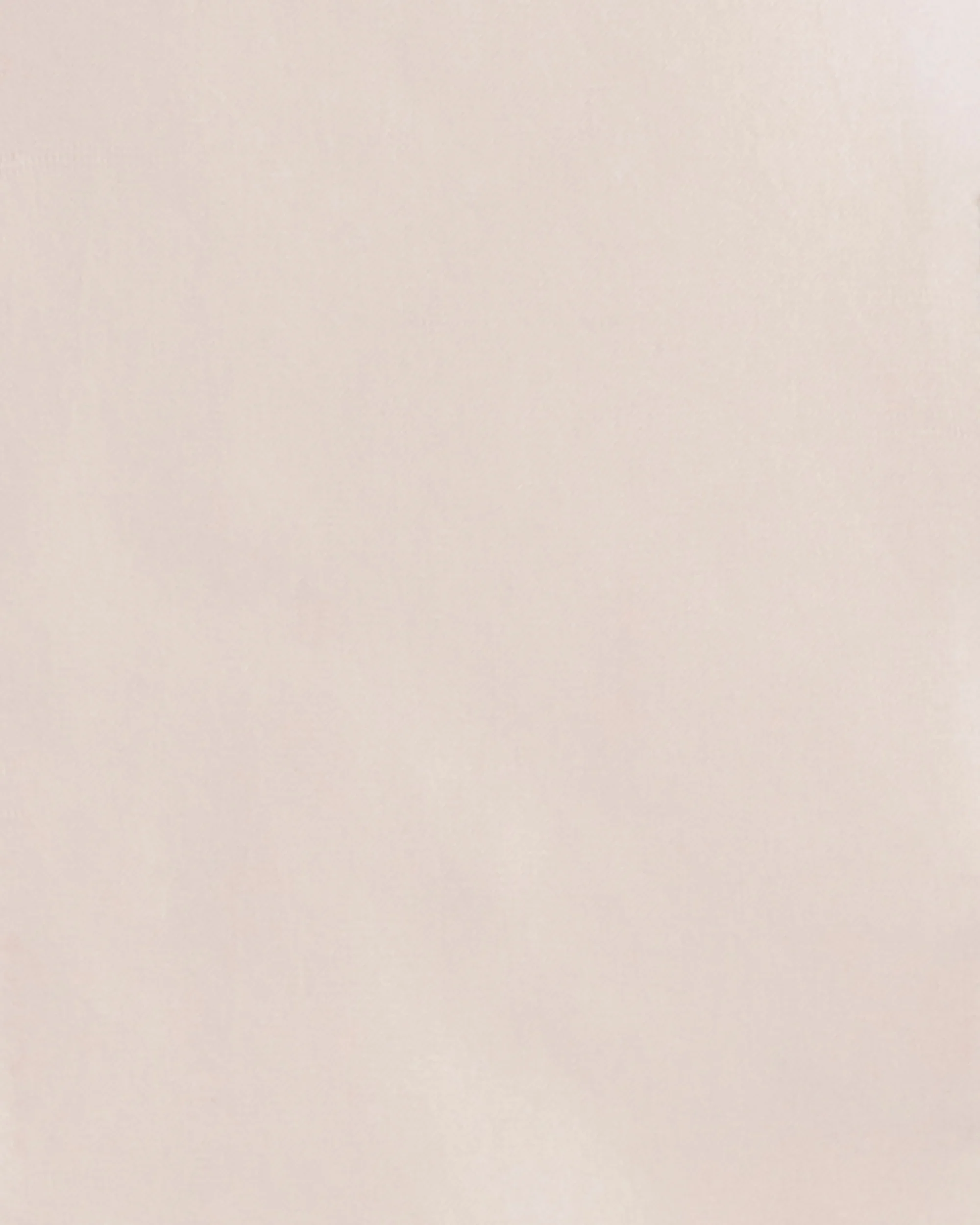
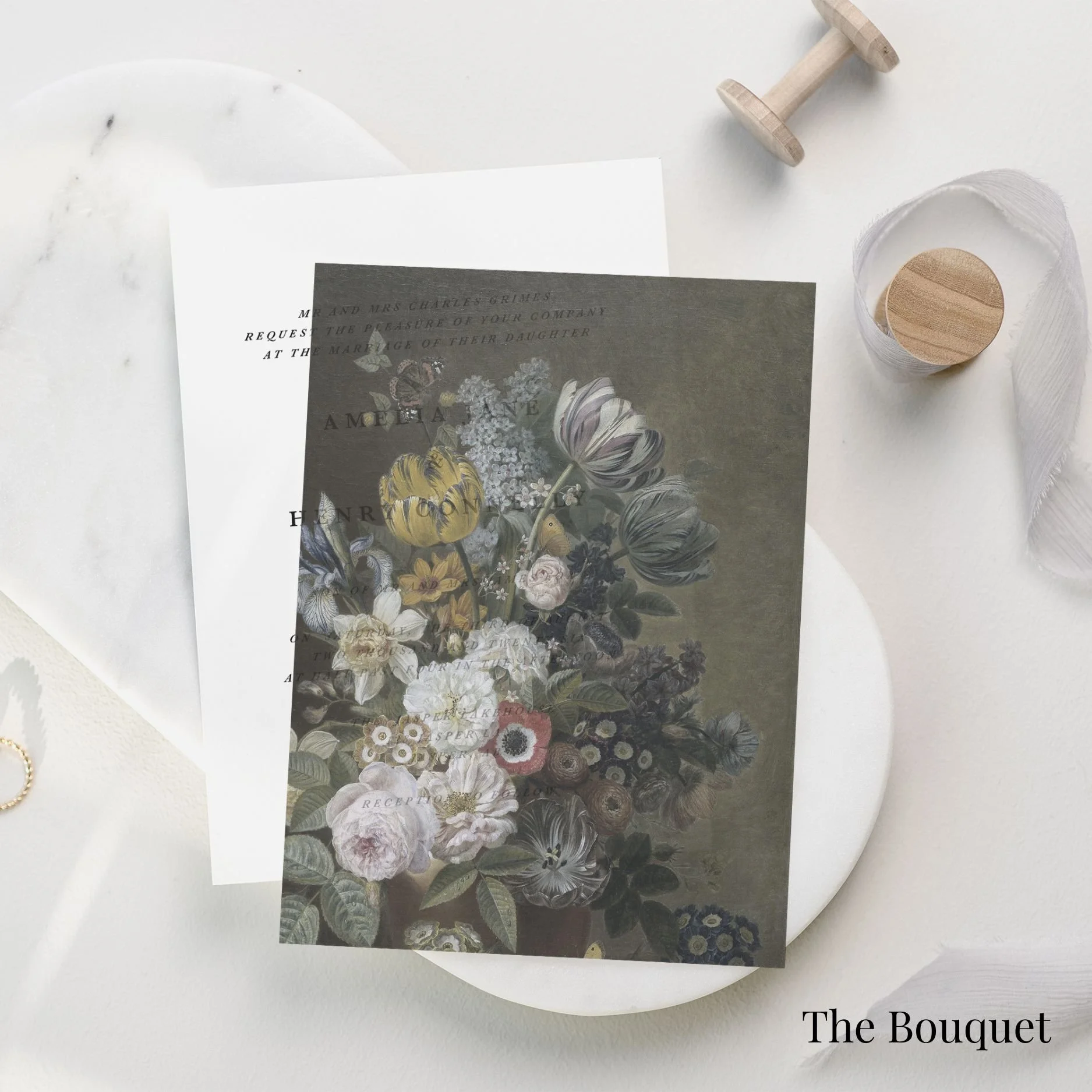
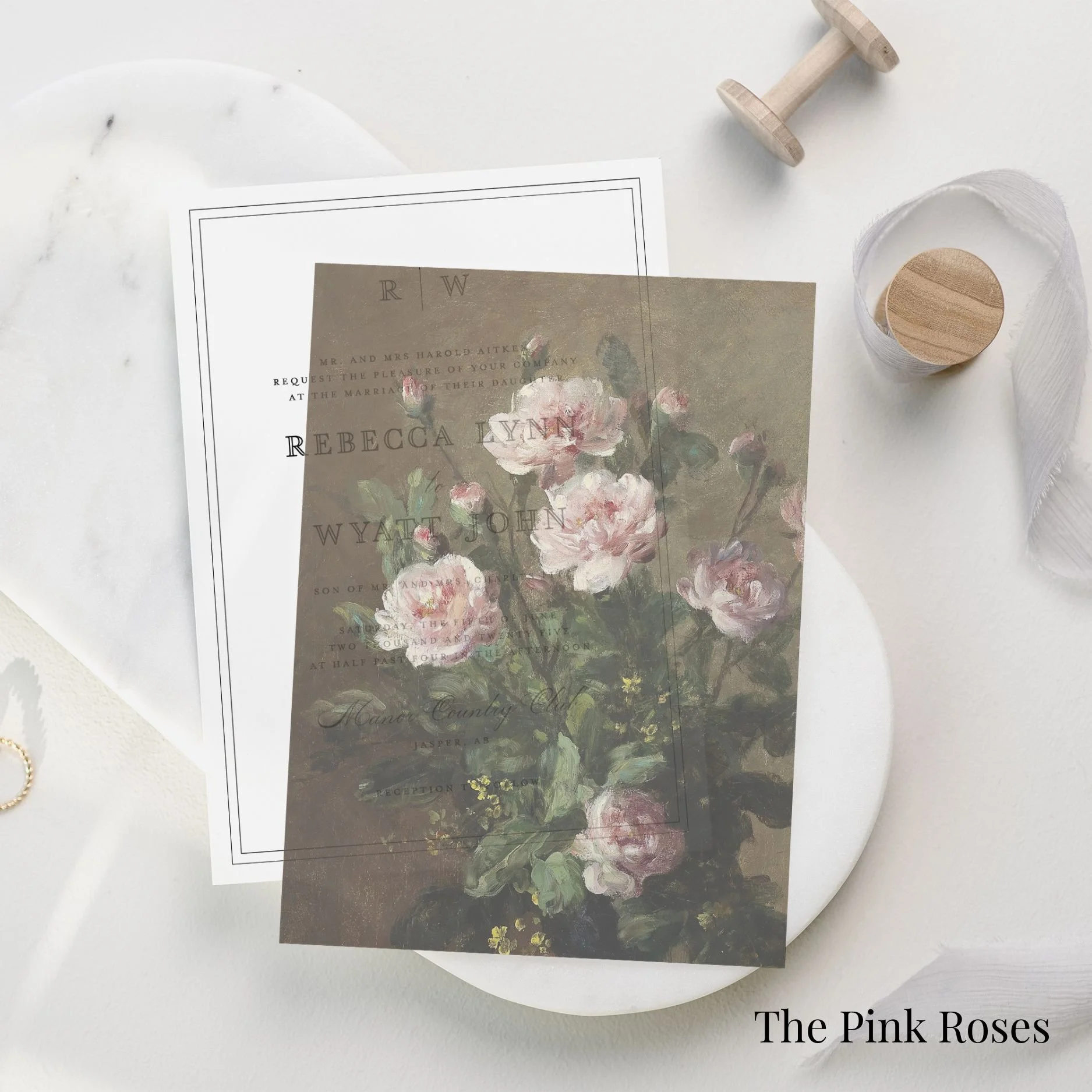
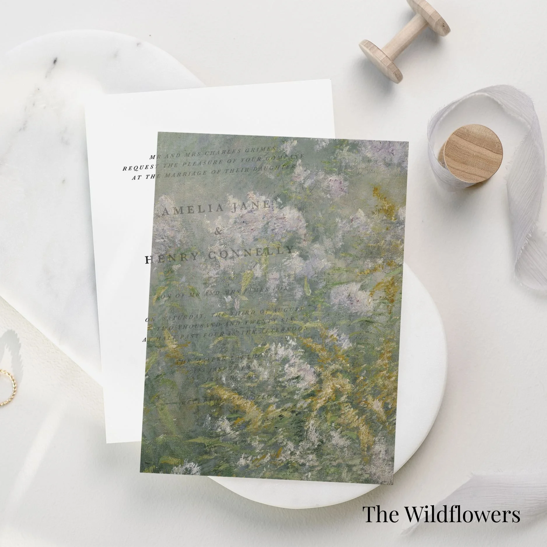
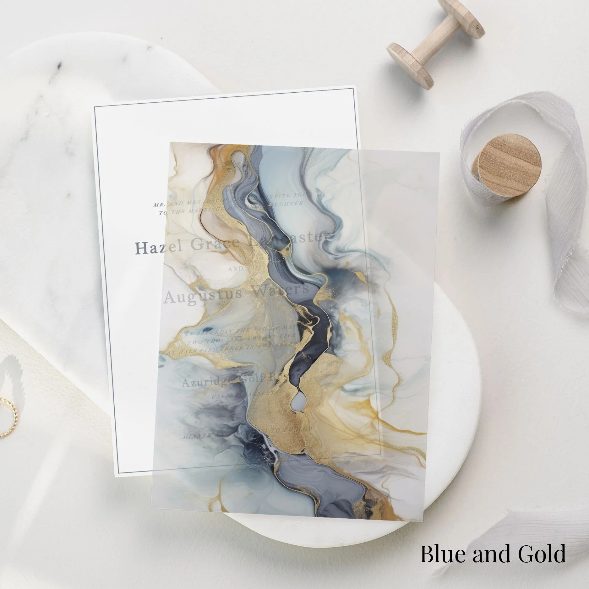
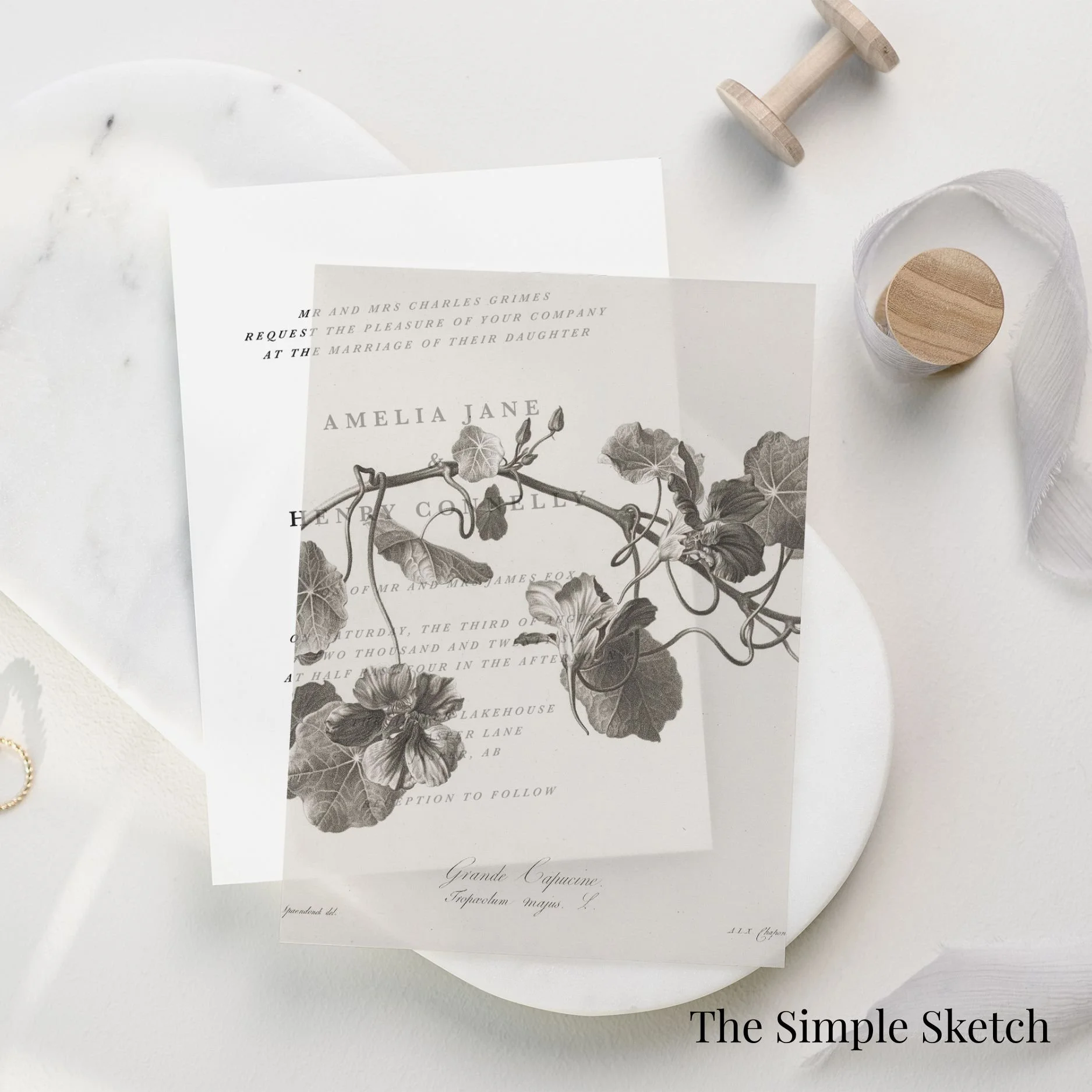
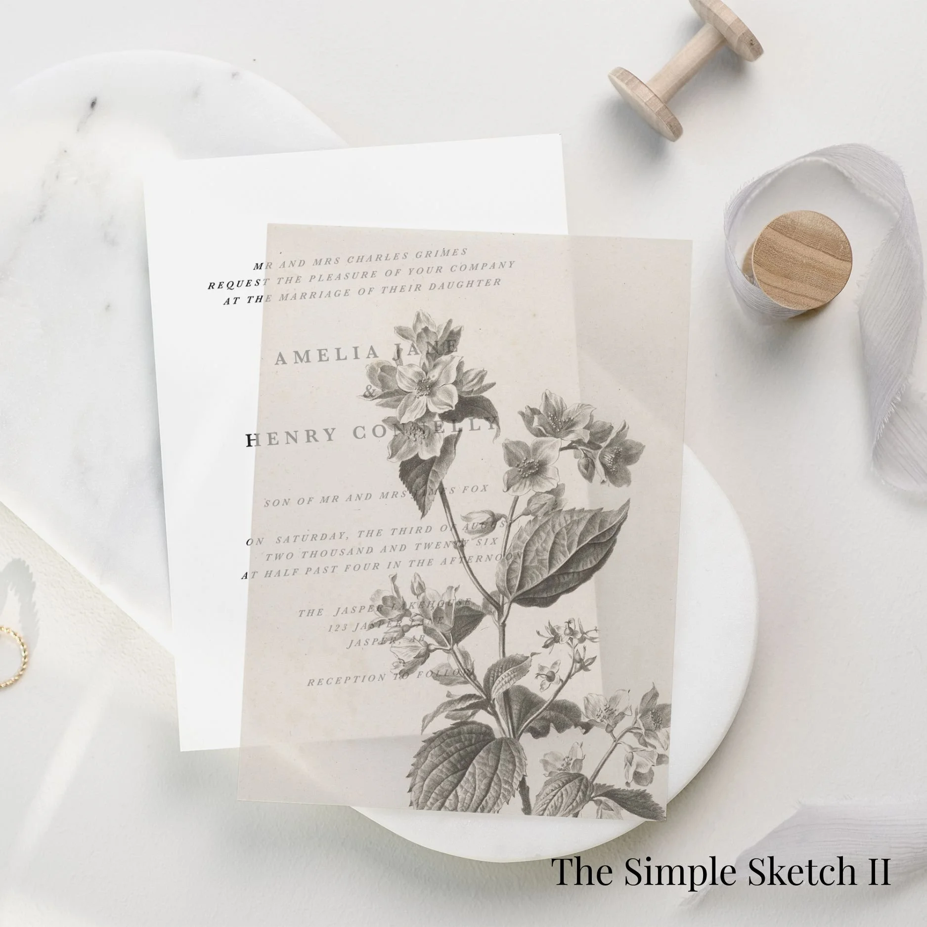
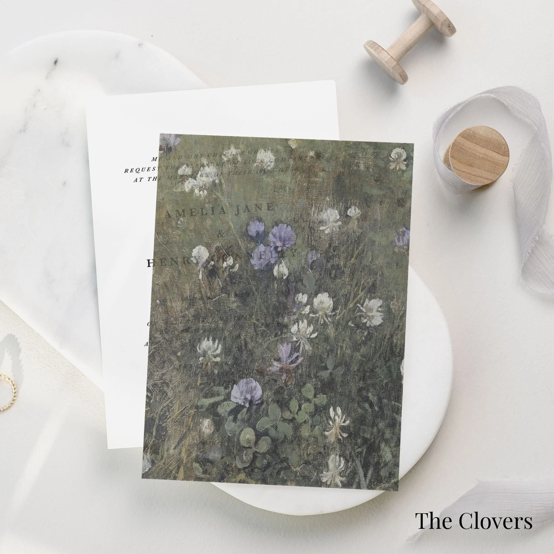
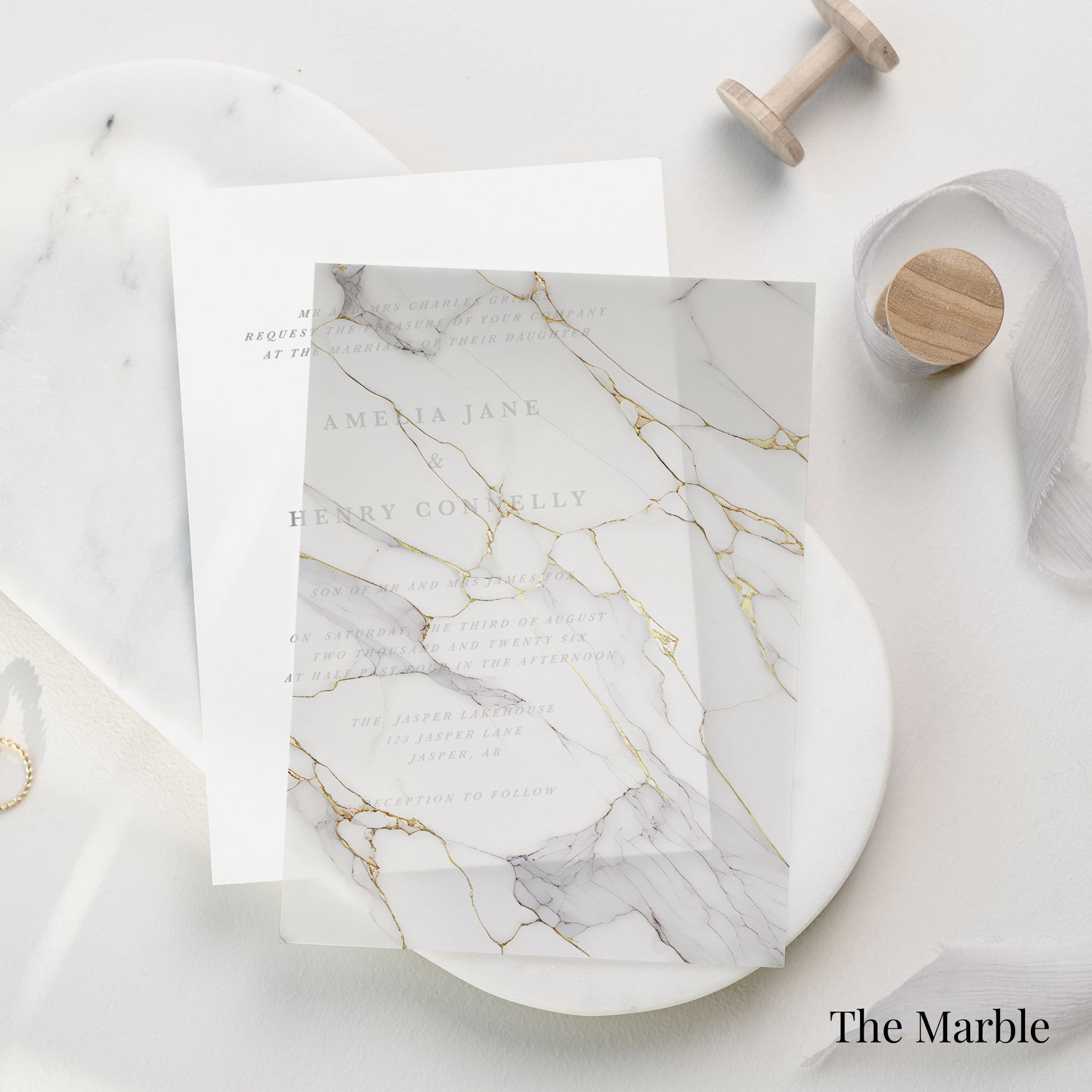
The paper you choose sets the foundation for your invitation suite. From smooth cotton cardstock to richly textured handmade paper, each option offers a different feeling in hand and a different visual finish.
-
Our standard semi-custom suites are printed on premium heavyweight cardstock, selected for its beautiful texture, refined finish, and ability to hold print detail with clarity. It is a timeless choice for couples who want an elevated invitation suite with a clean, polished look.
-
Flexible, expert advice when you need it. Book hourly support across a range of topics—from planning to problem-solving. This focused consultation will help clarify your goals, map out next steps, and identify opportunities for growth.
-
Flexible, expert advice when you need it. Book hourly support across a range of topics—from planning to problem-solving. This focused consultation will help clarify your goals, map out next steps, and identify opportunities for growth.
-
For a more tactile and heirloom-inspired finish, handmade paper is available as an upgrade. With softly deckled edges and natural variation from piece to piece, handmade paper brings a romantic, artful quality to your suite. It is especially beautiful for intimate weddings, editorial-inspired celebrations, and couples who want their stationery to feel collected, personal, and one of a kind.
Printing methods
Your printing method plays a significant role in the overall feeling of your suite. Whether you prefer the clean elegance of digital printing, the tactile impression of letterpress, or the luminous detail of foil, each method creates a distinct finish.
Premium Digital
-
Digital printing is the standard print method for our semi-custom collection. It offers a beautiful, crisp finish and allows for full-colour artwork, delicate details, and flexible colour customization.
-
This is the best option for couples who want a refined and polished suite with a shorter production timeline and a more accessible investment. Digital printing is especially well suited to soft washes of colour, illustrated details, fine typography, and modern minimalist layouts.
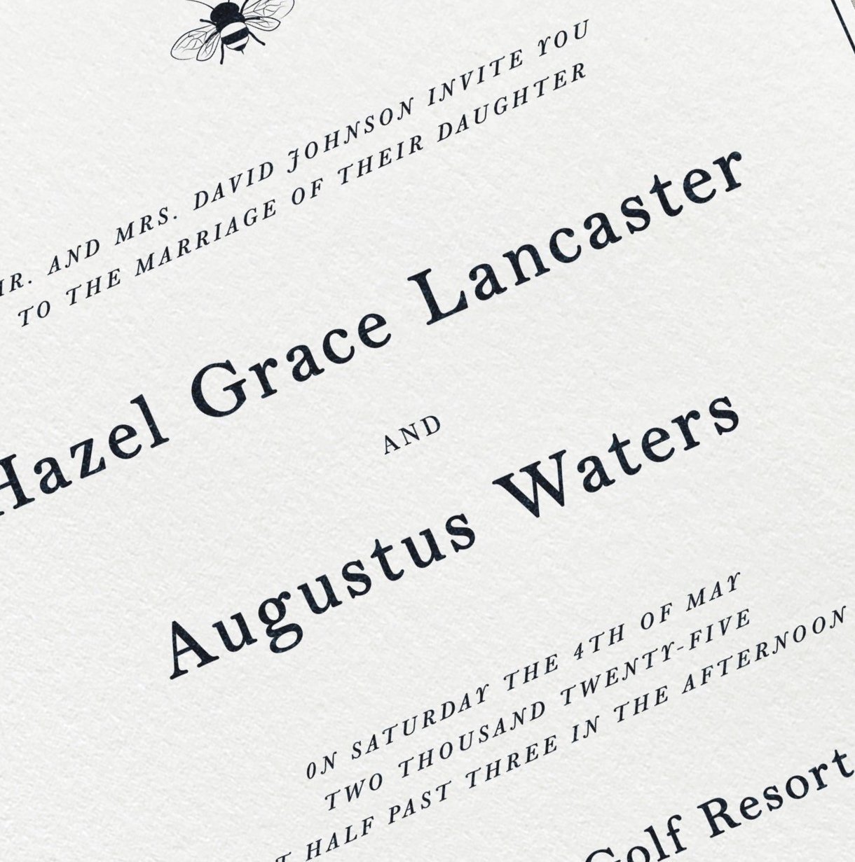
Letterpress
-
Letterpress is a traditional print method that presses ink into the paper, creating a soft, tactile impression you can see and feel. It has a quiet, understated luxury and pairs beautifully with simple typography, minimal layouts, and fine cotton paper.
-
Letterpress is available as an upgrade for select semi-custom suites. Because this method is best suited to one or two ink colours, it is ideal for couples drawn to a timeless, textural, and deeply refined finish.
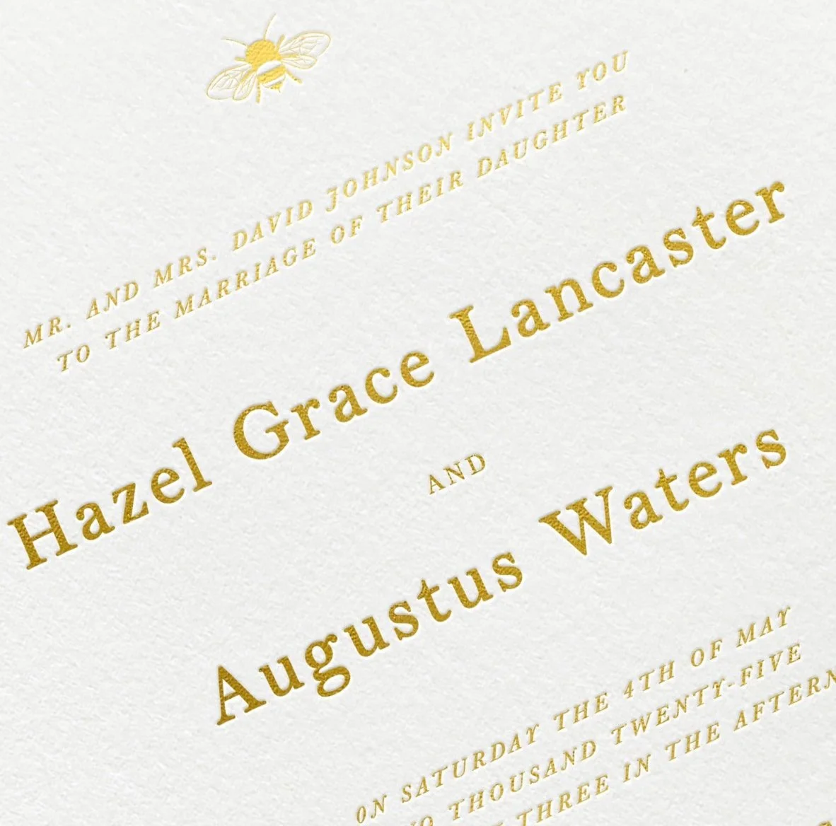
Hot Foil Stamping
-
Foil stamping uses heat and pressure to apply metallic or matte foil to the paper, creating a luminous finish that catches the light beautifully. It is an elegant option for adding subtle drama, shine, or contrast to your invitation suite.
-
Foil is available as an upgrade for select designs and works best for names, monograms, borders, small design details, or statement typography. Choose from classic metallic finishes such as gold, silver, or champagne, or opt for a more understated matte foil depending on the mood of your suite.
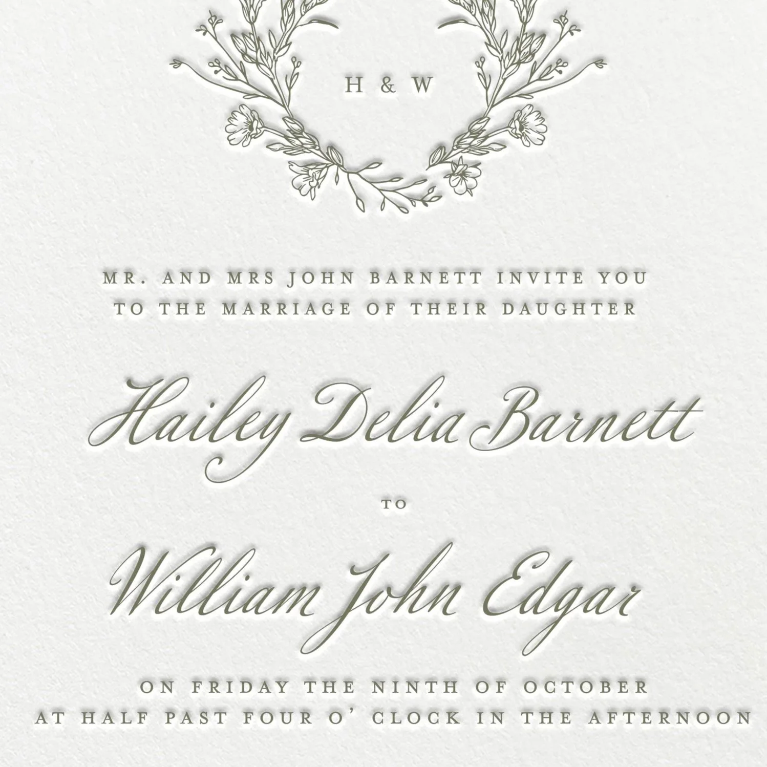
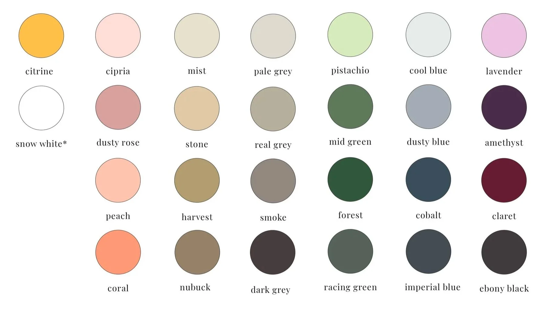
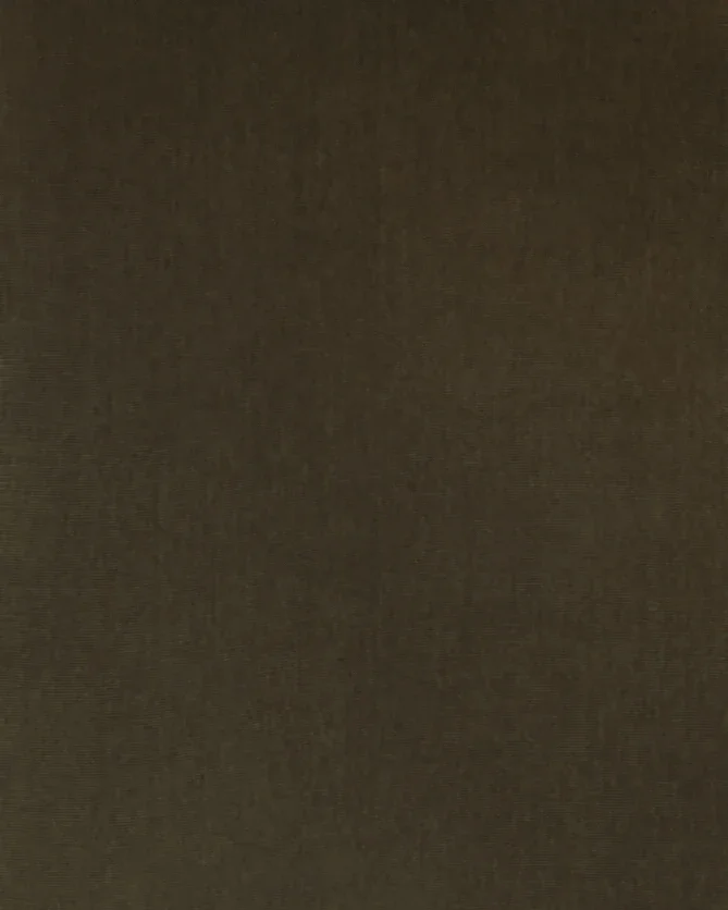
INK COLOURS
You may choose from our curated colour options or request a custom colour match based on your wedding palette. This may include colours from your florals, bridesmaid dresses, linens, venue, or overall design inspiration.
Our colour palettes are intentionally soft, timeless, and nature-inspired, ranging from warm neutrals and muted earth tones to deep greens, soft blues, romantic blushes, and moody seasonal shades.
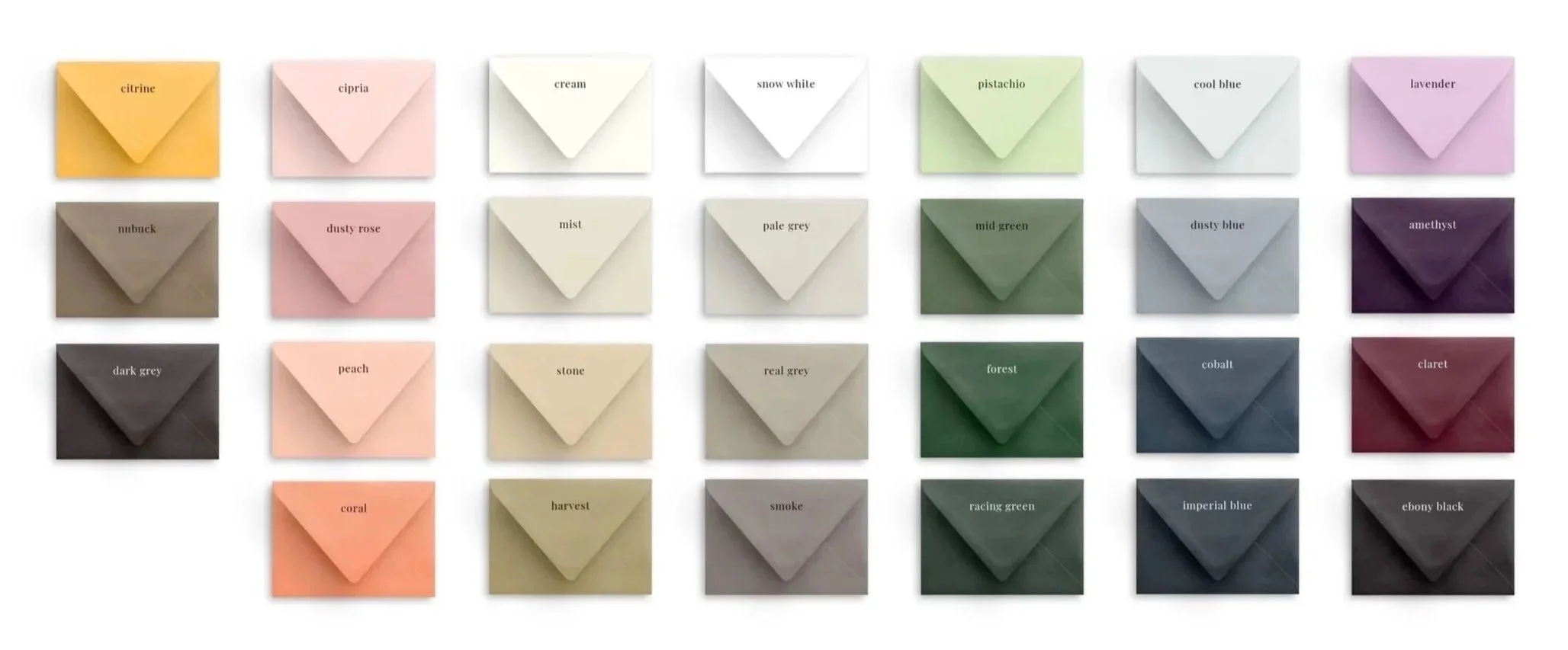
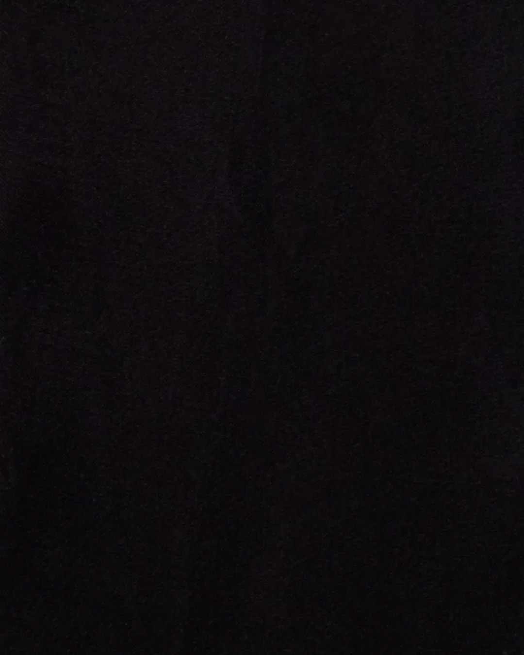
envelope COLOURS
Envelope colour is one of the easiest ways to bring depth and personality to your suite. Each collection design can be paired with a range of envelope colours, from classic neutrals to richer, moodier tones.
Your envelope selection can be kept minimal and understated, or used as a way to introduce contrast and create a more layered, editorial look. For a cohesive finish, envelope colours can also be paired with matching envelope liners, silk ribbon, and wax seals.
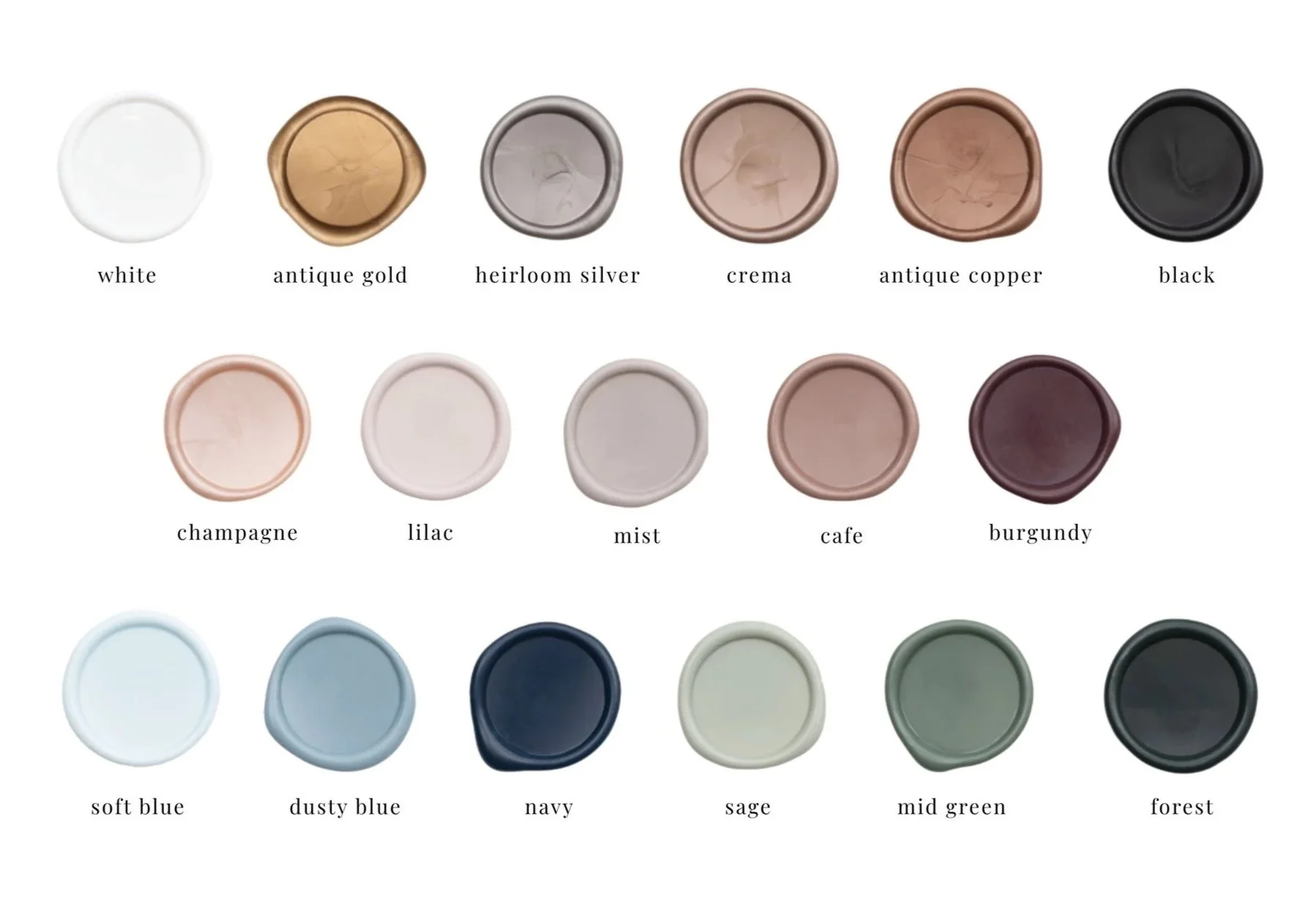
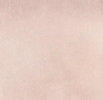
wax seal COLOURS
wax seal designs
silk ribbon


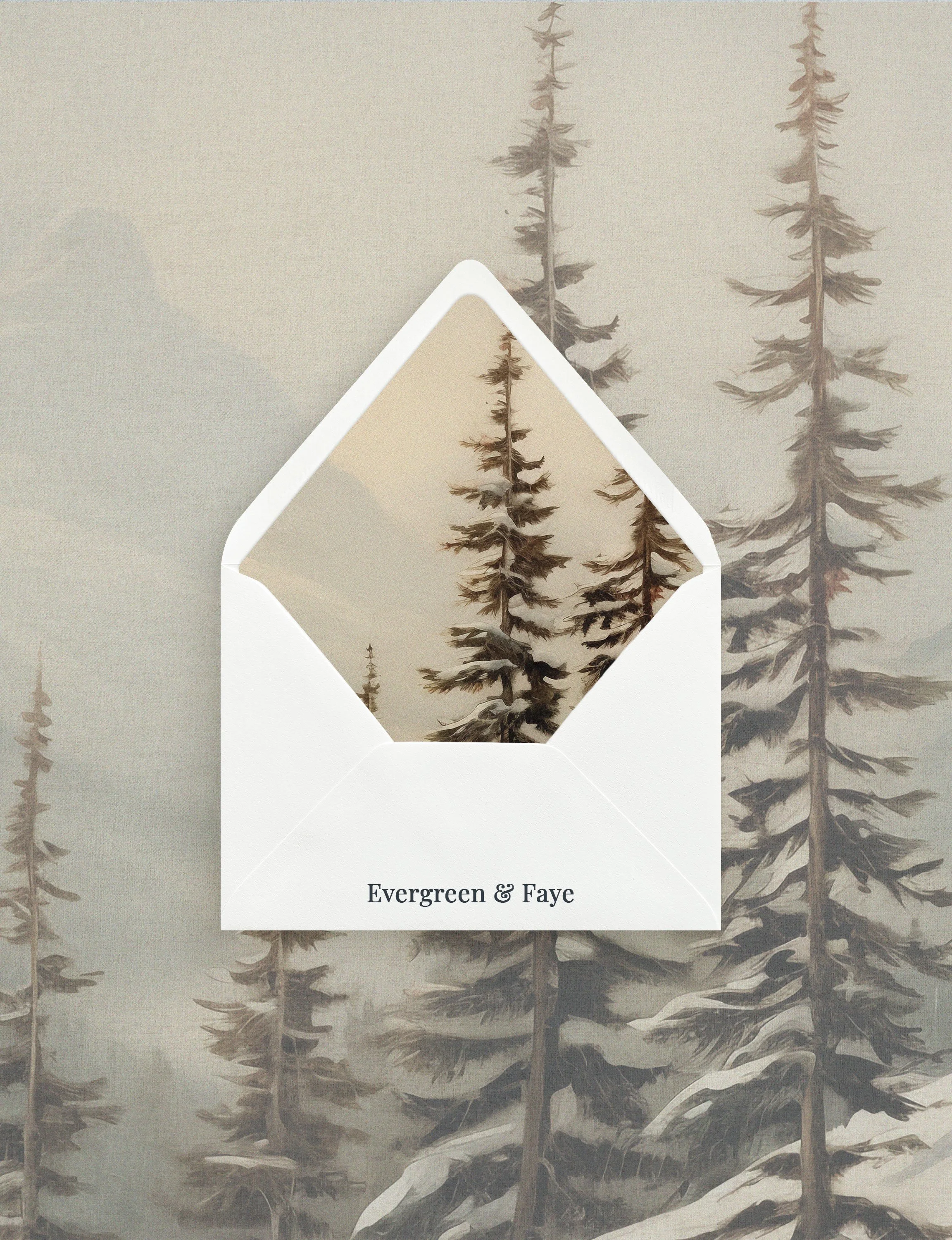
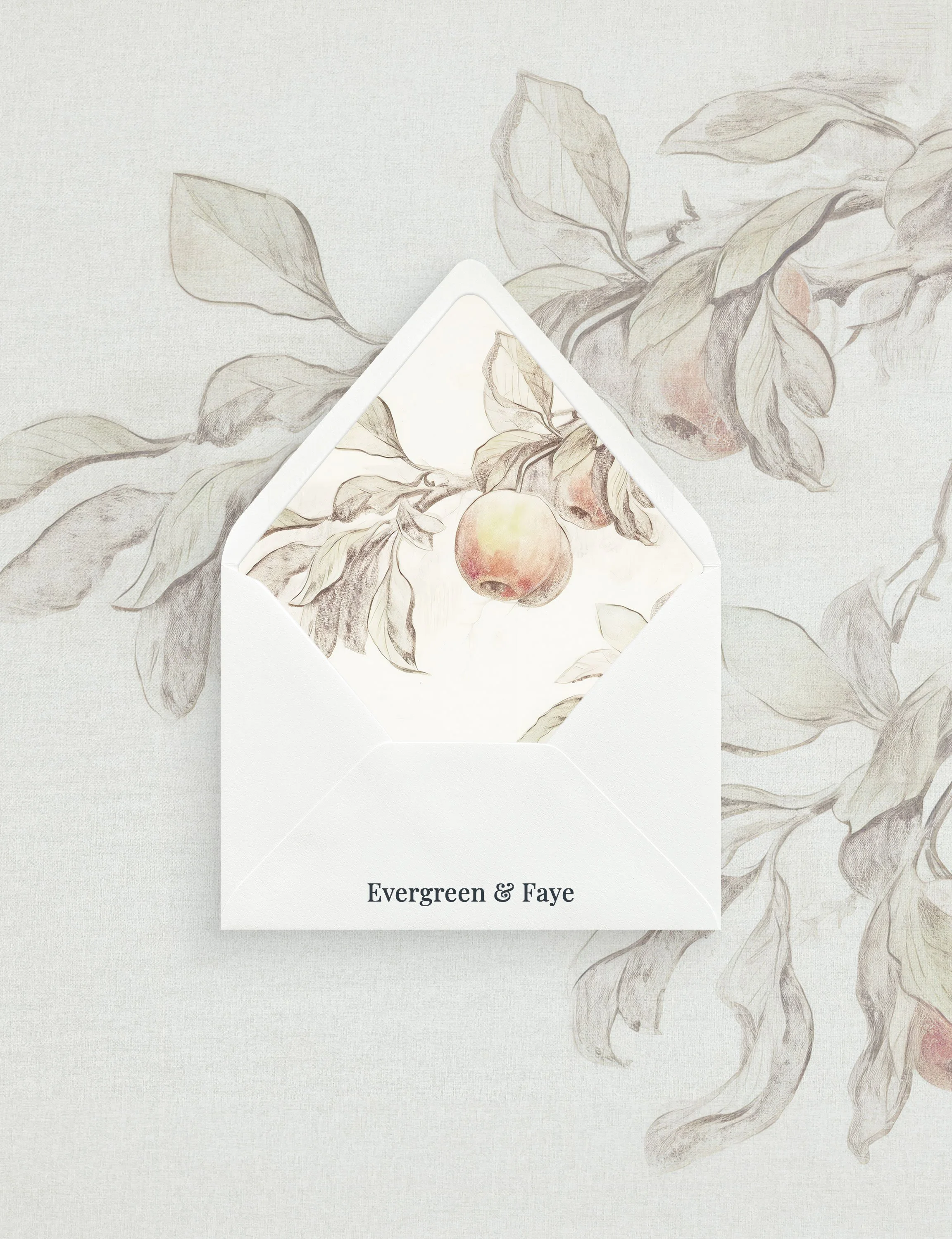
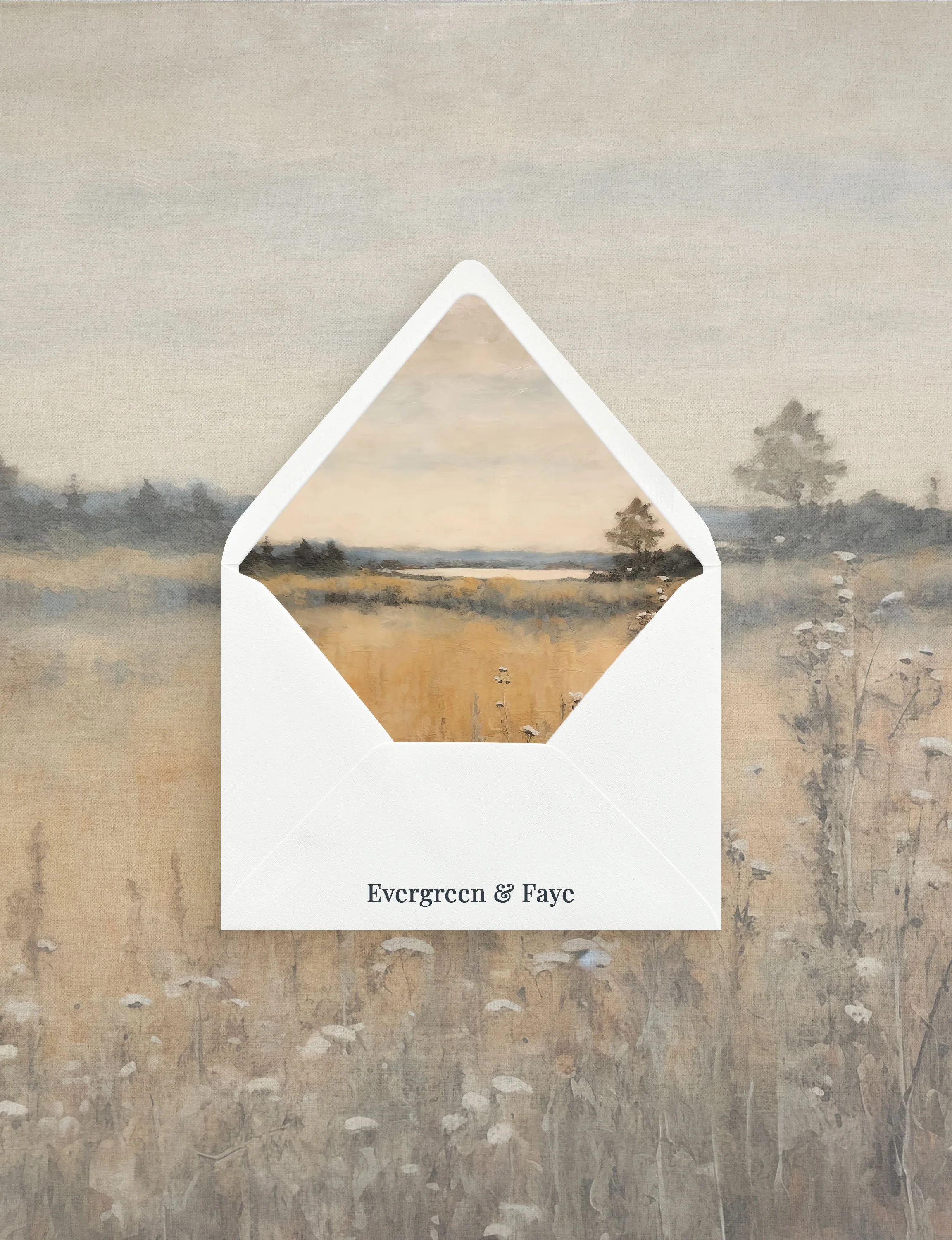
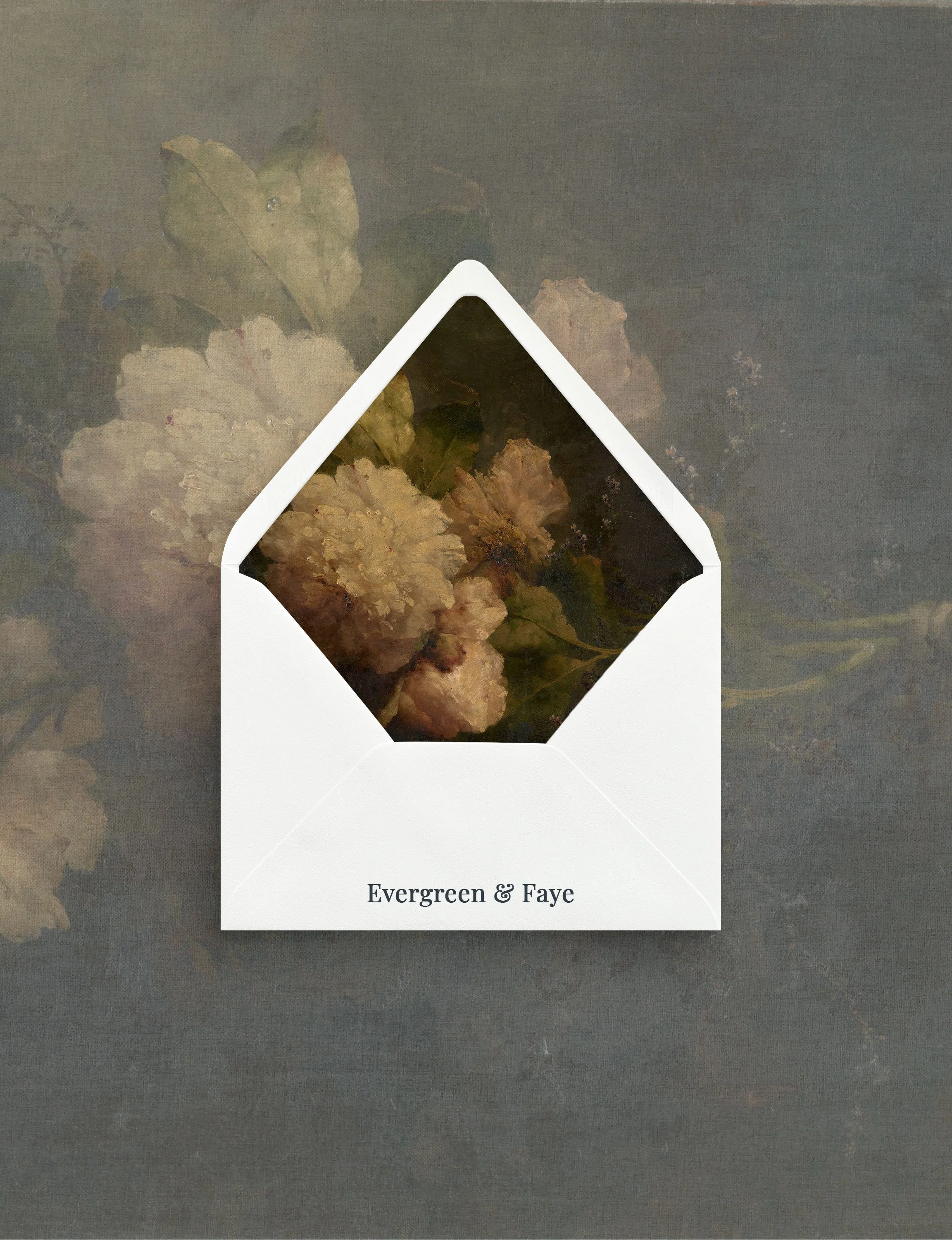
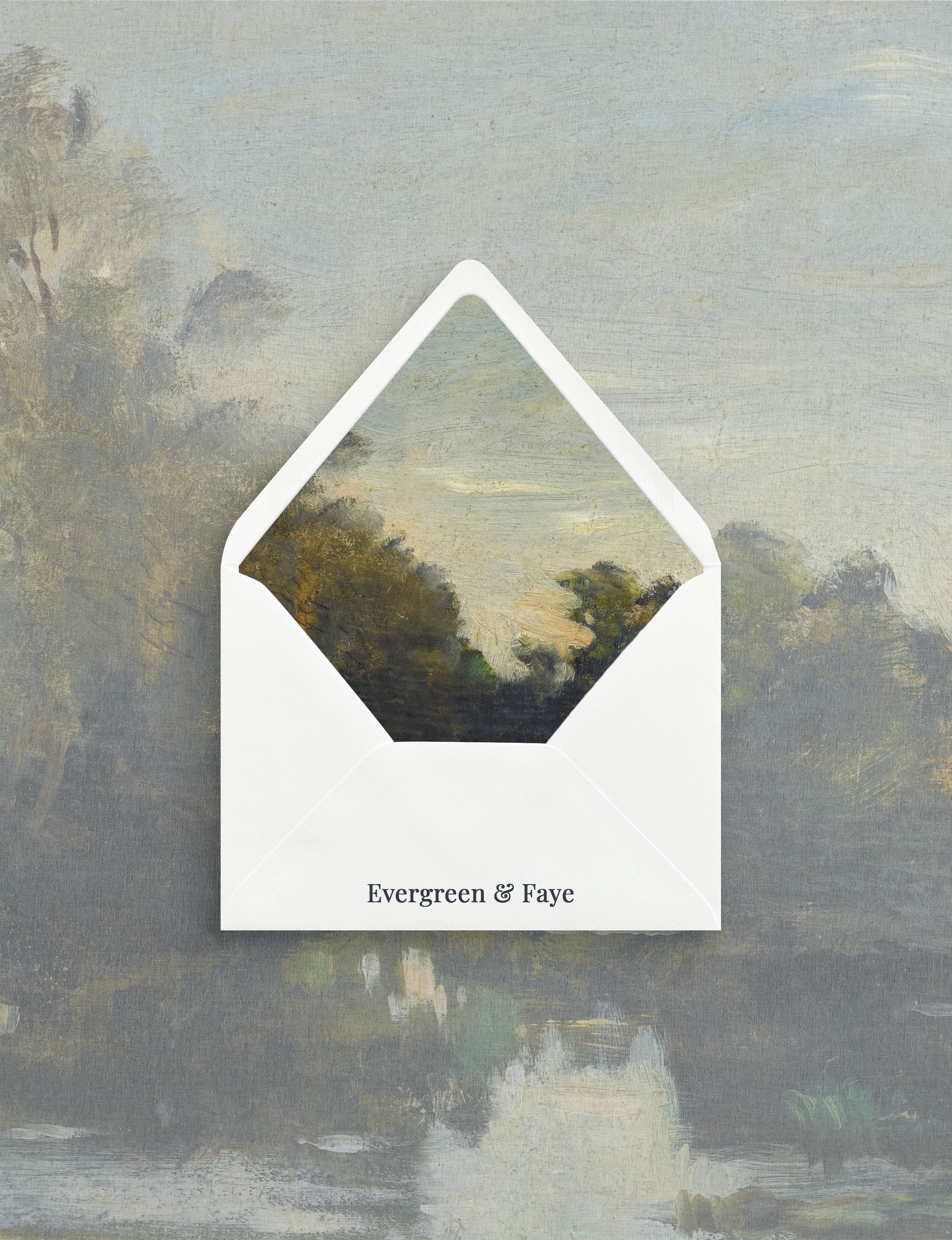
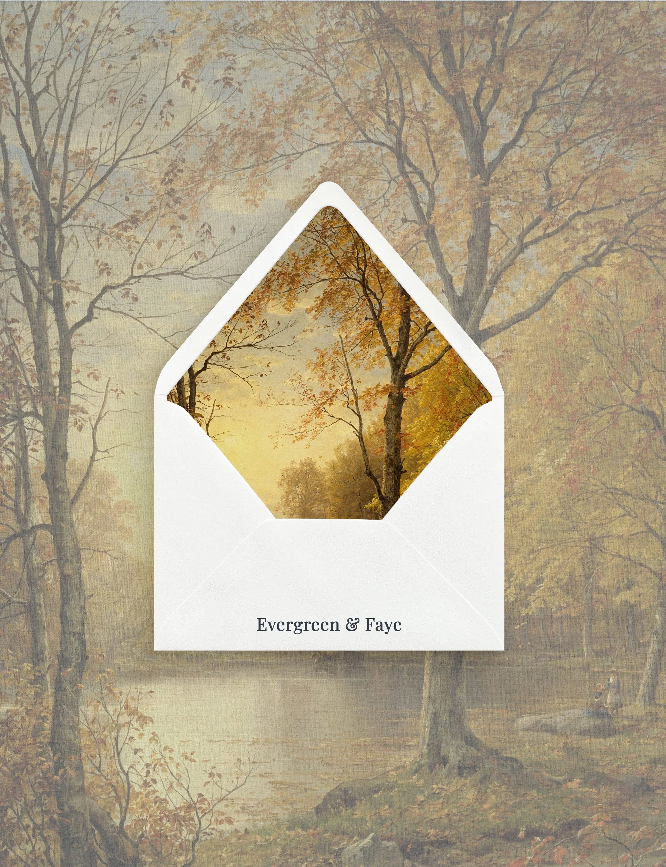
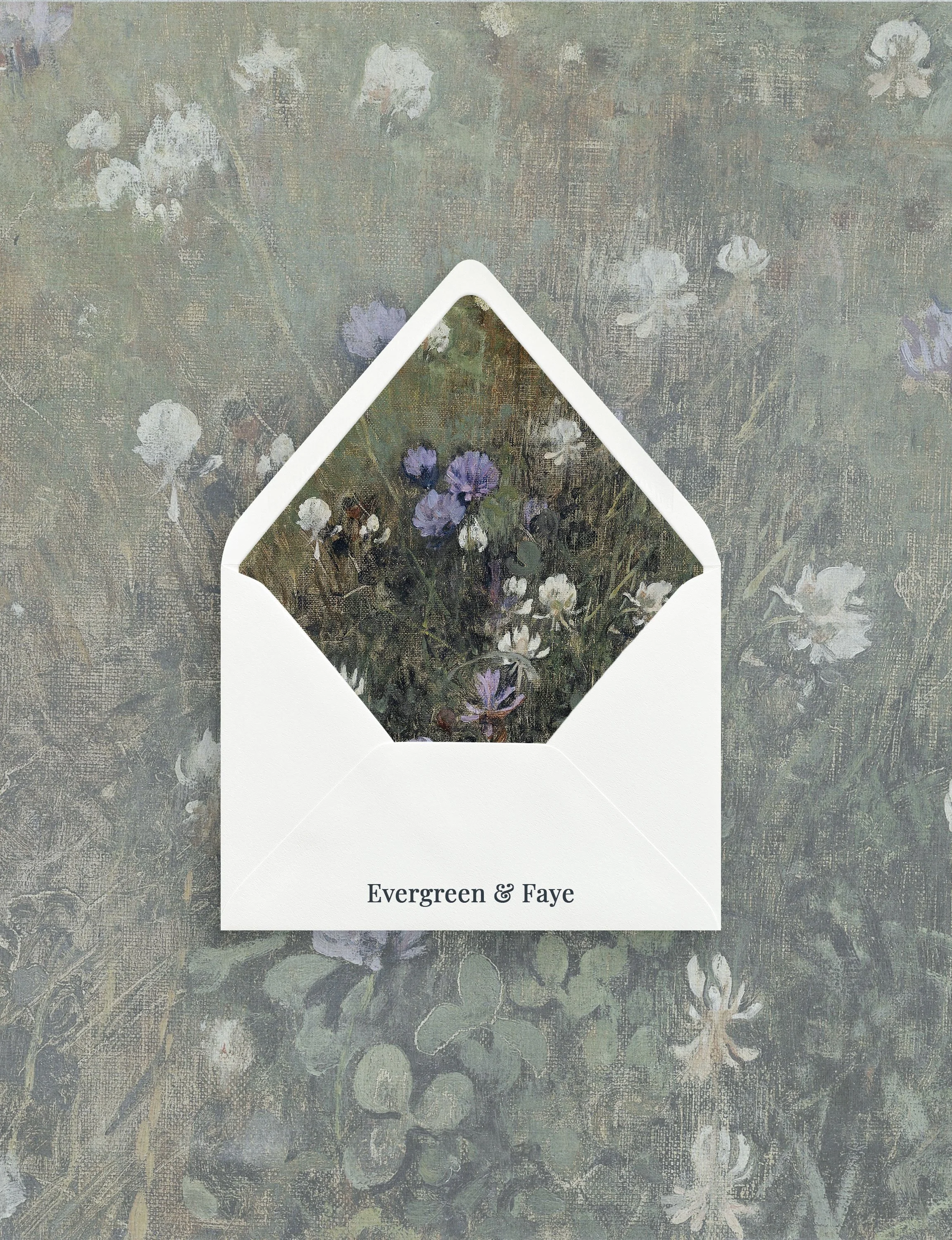
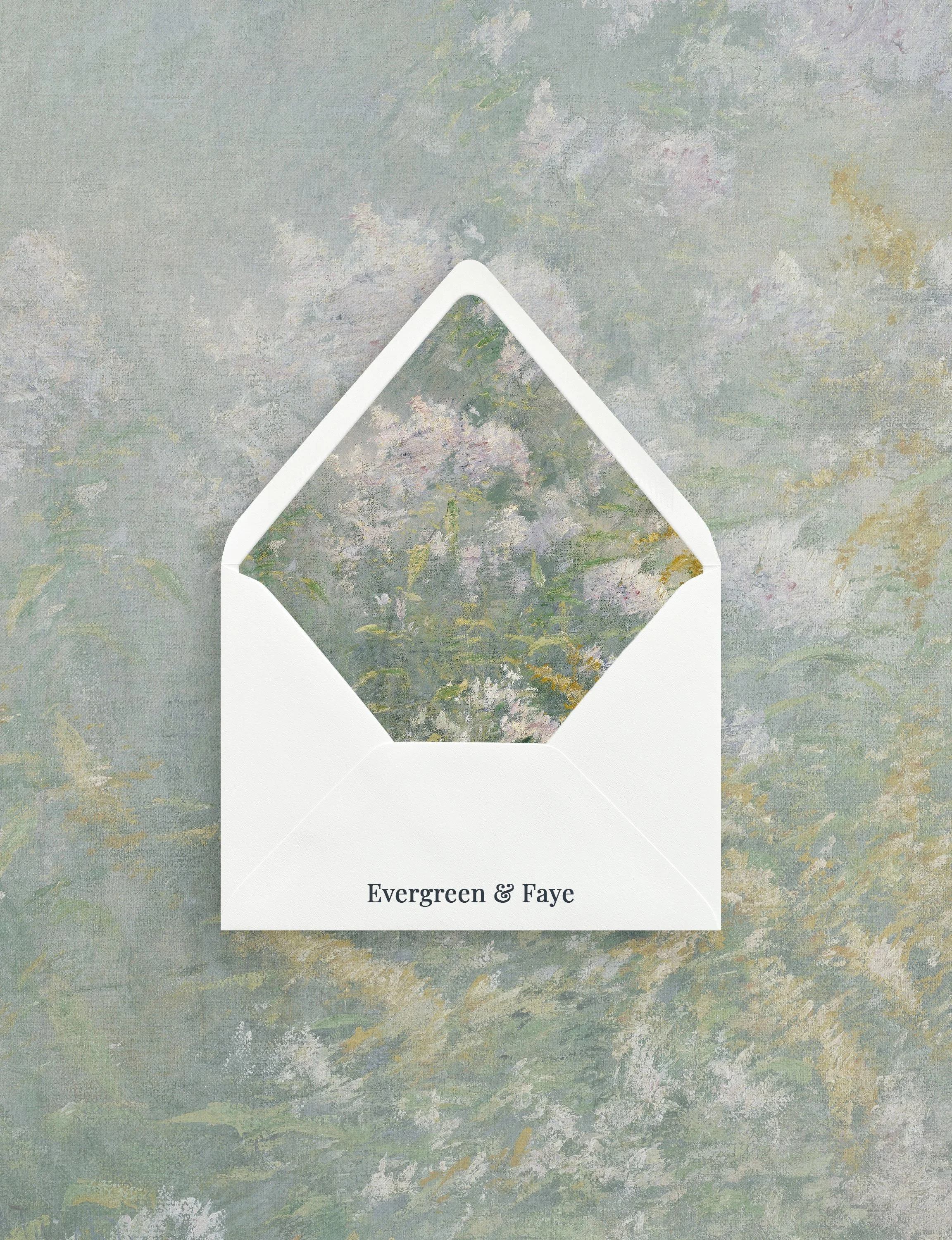
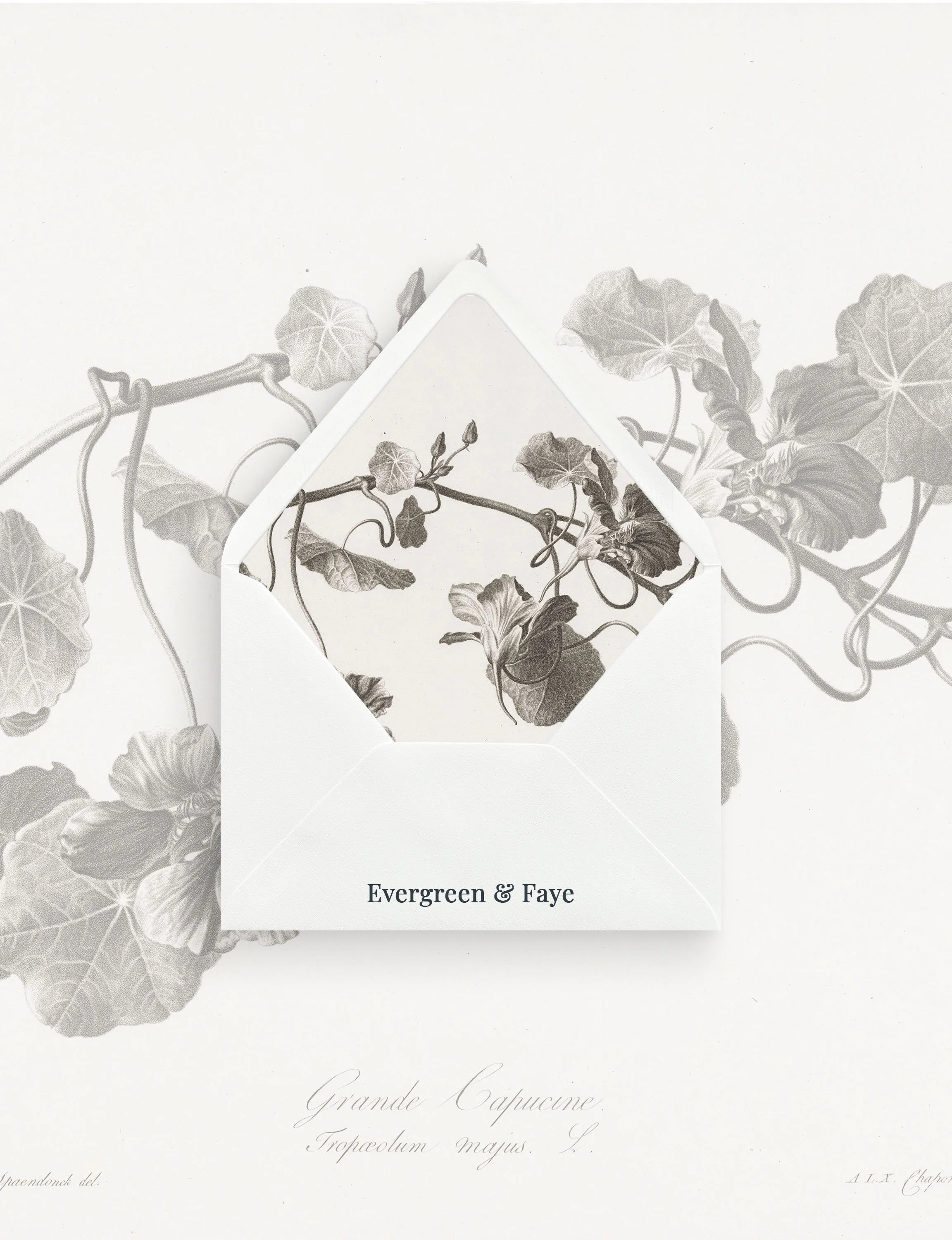
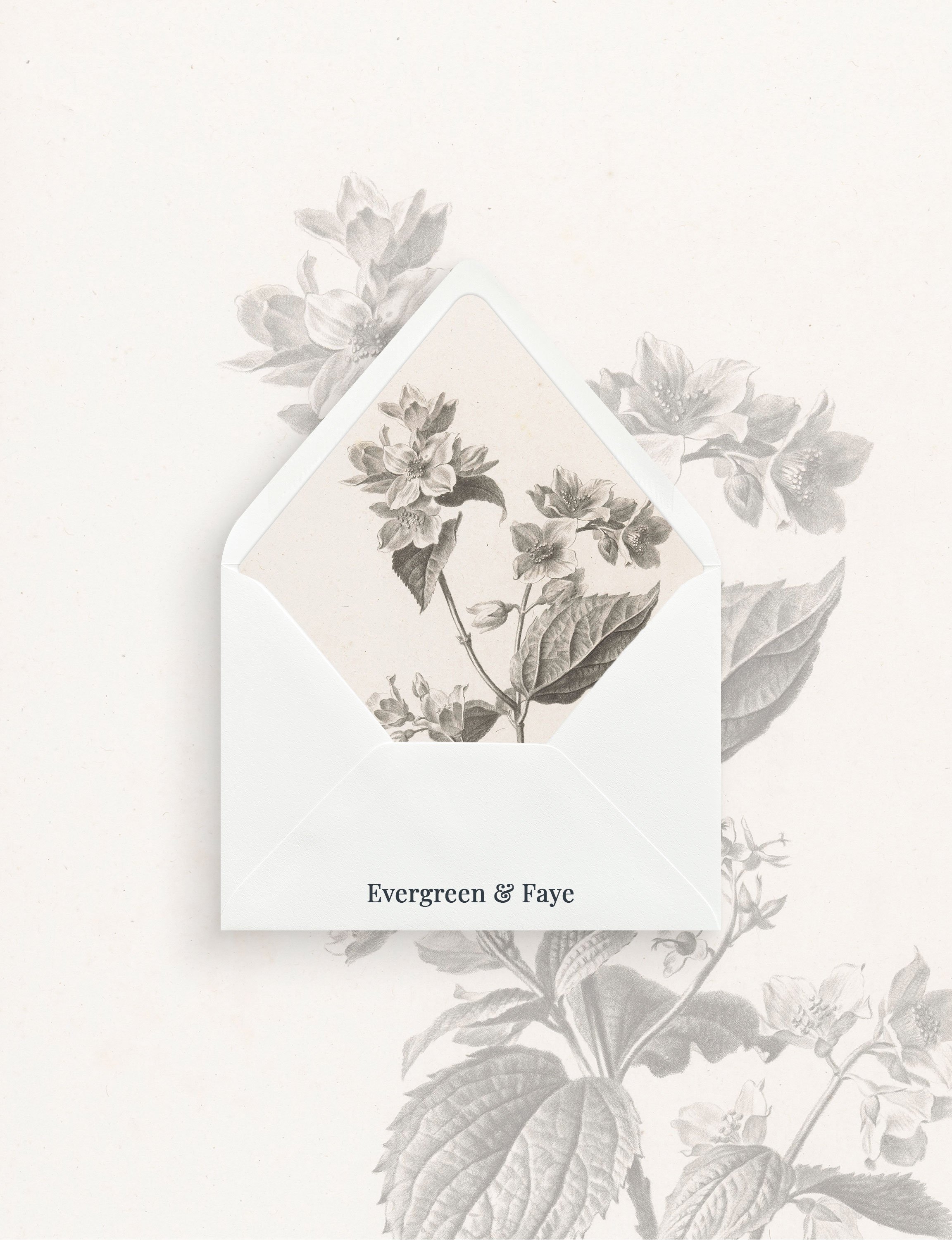
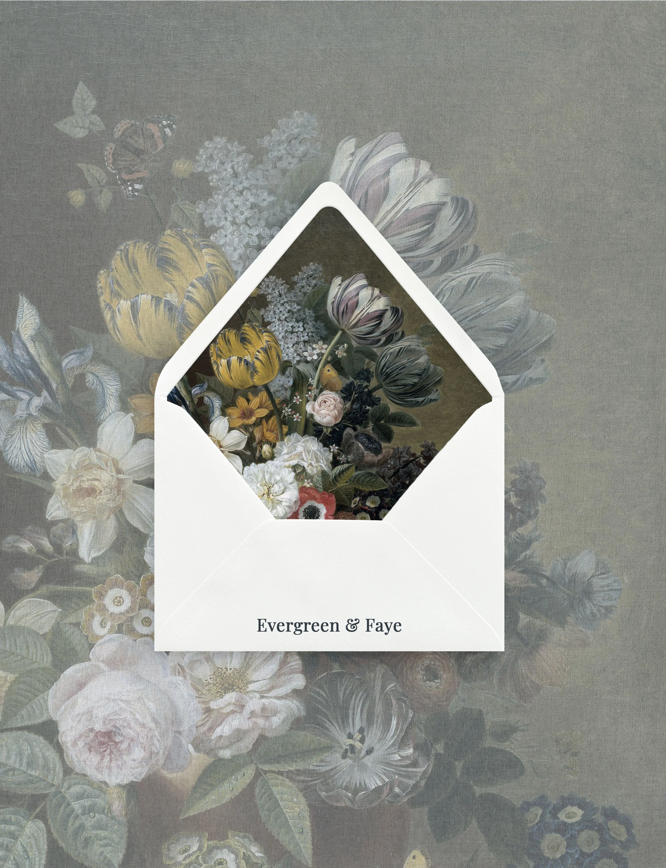
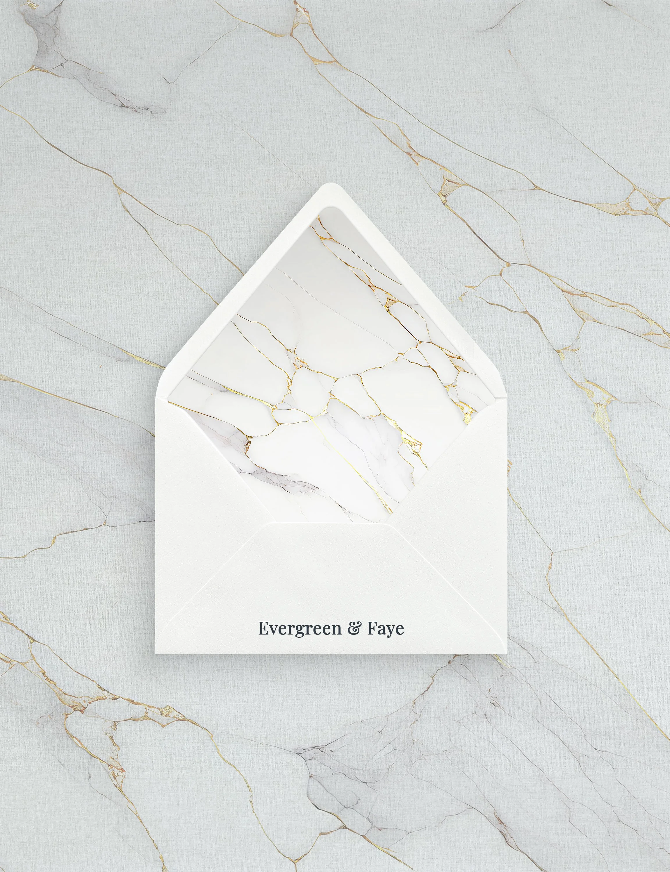
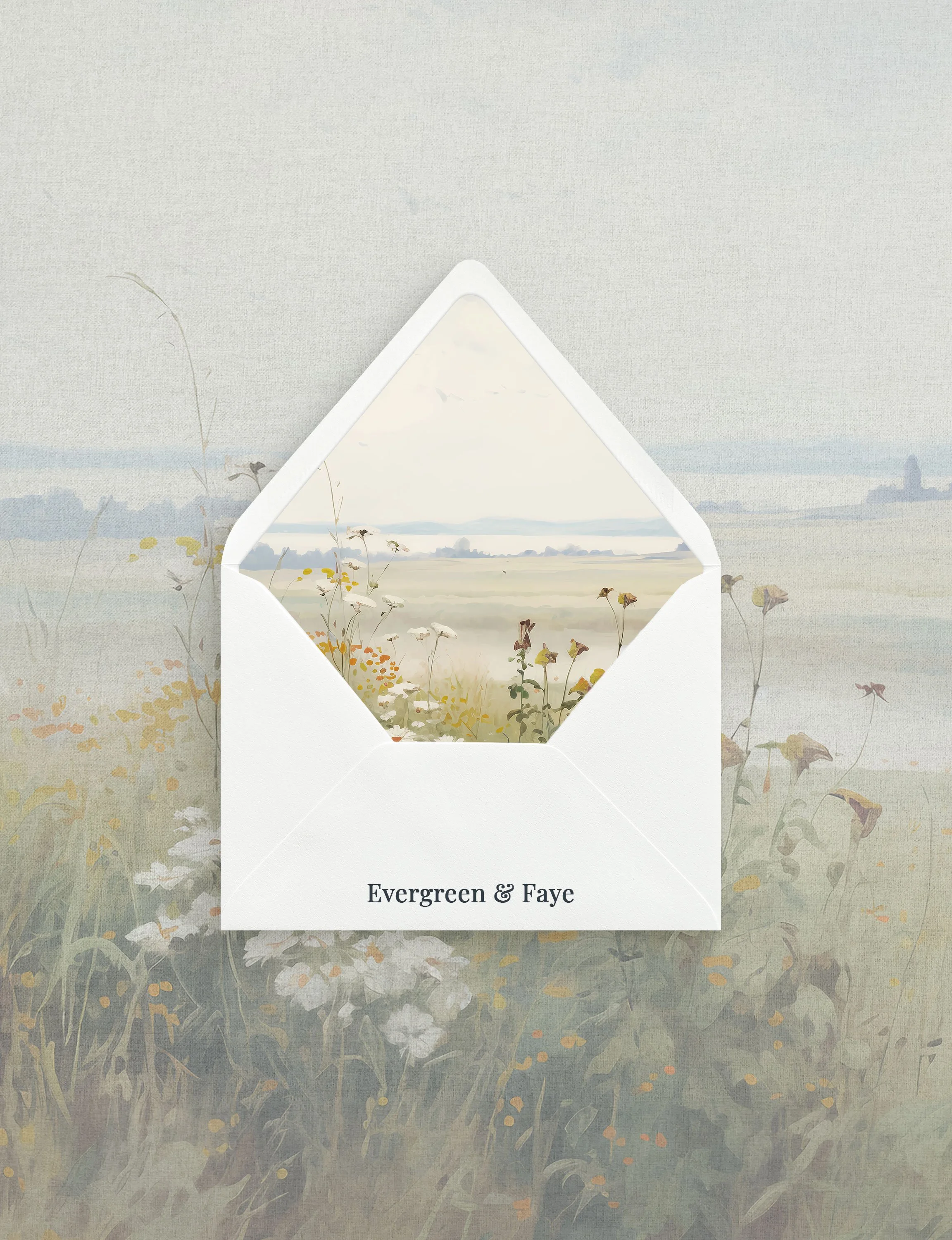
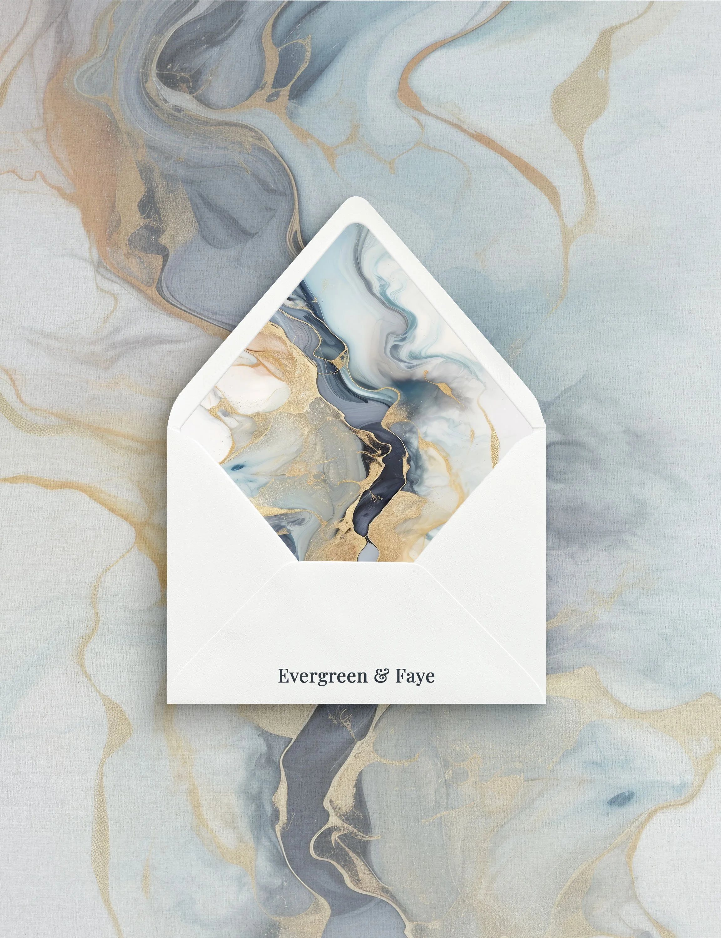
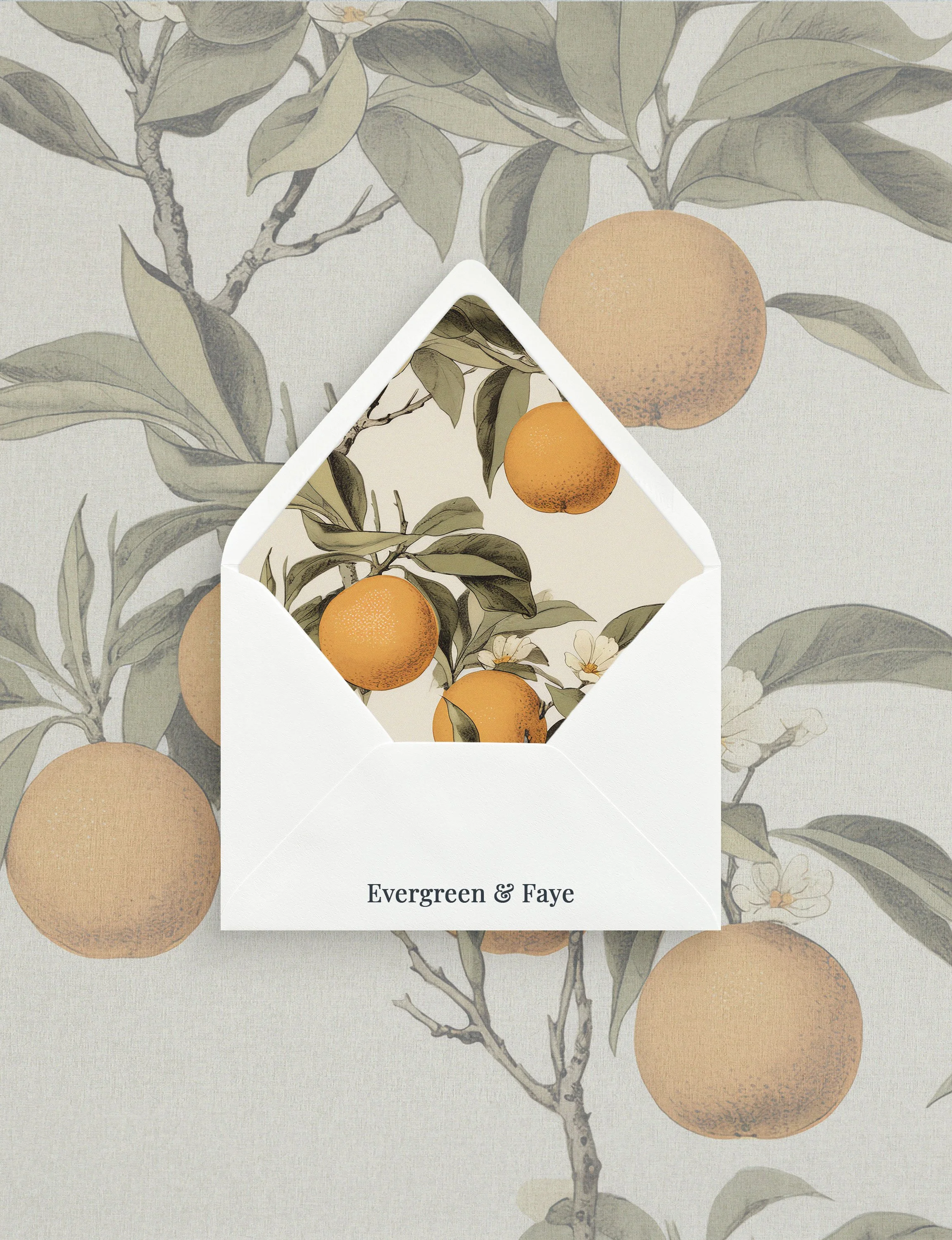
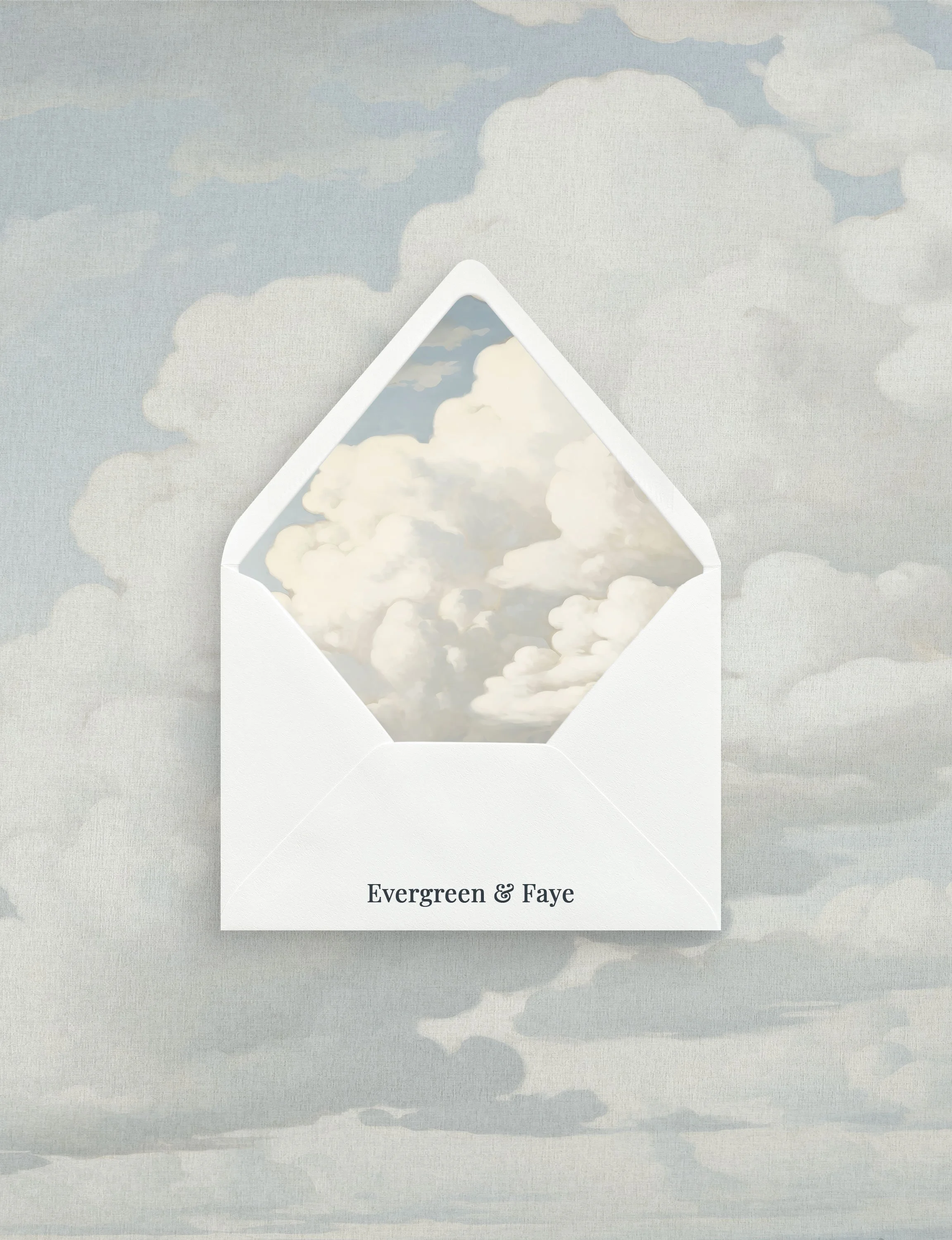
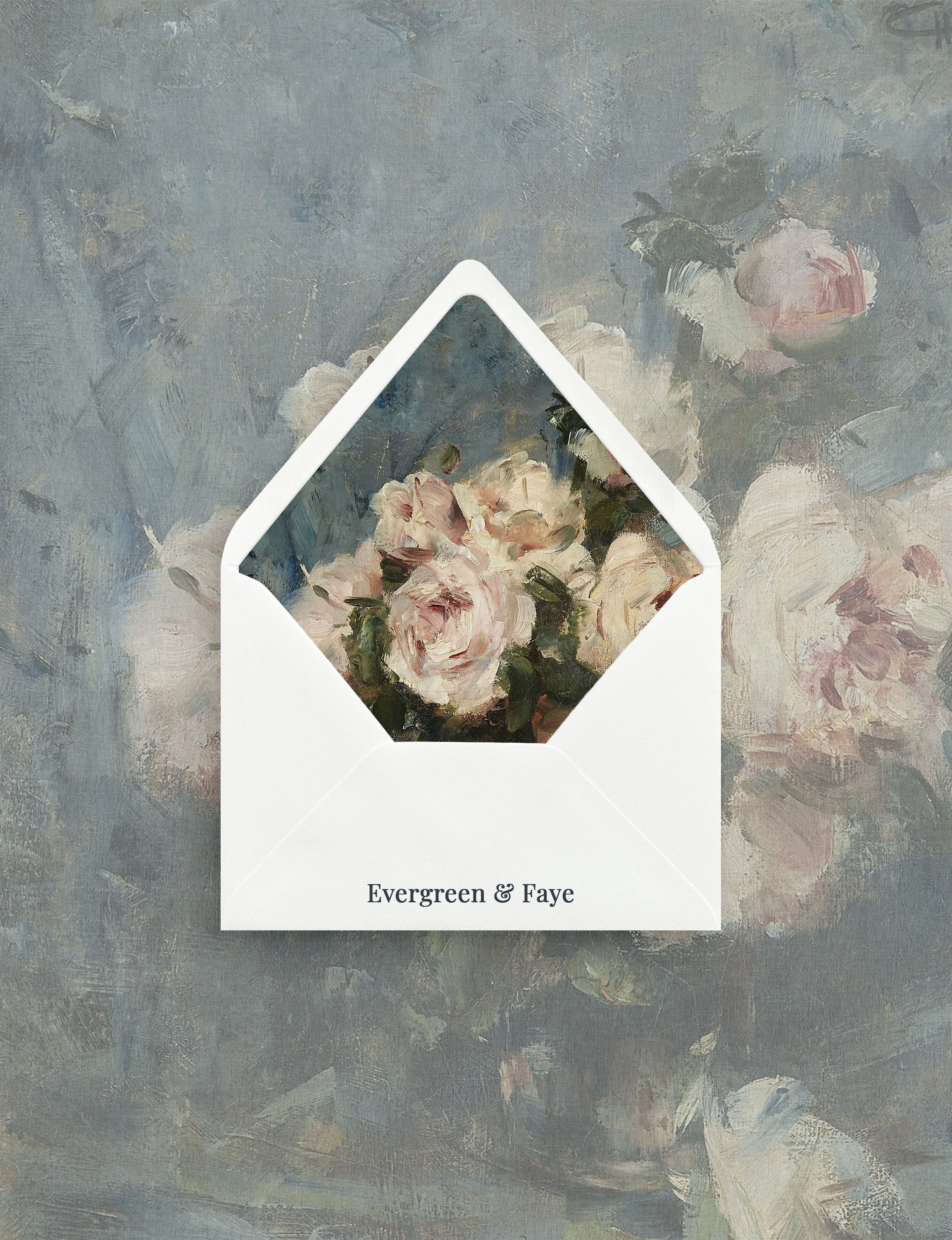
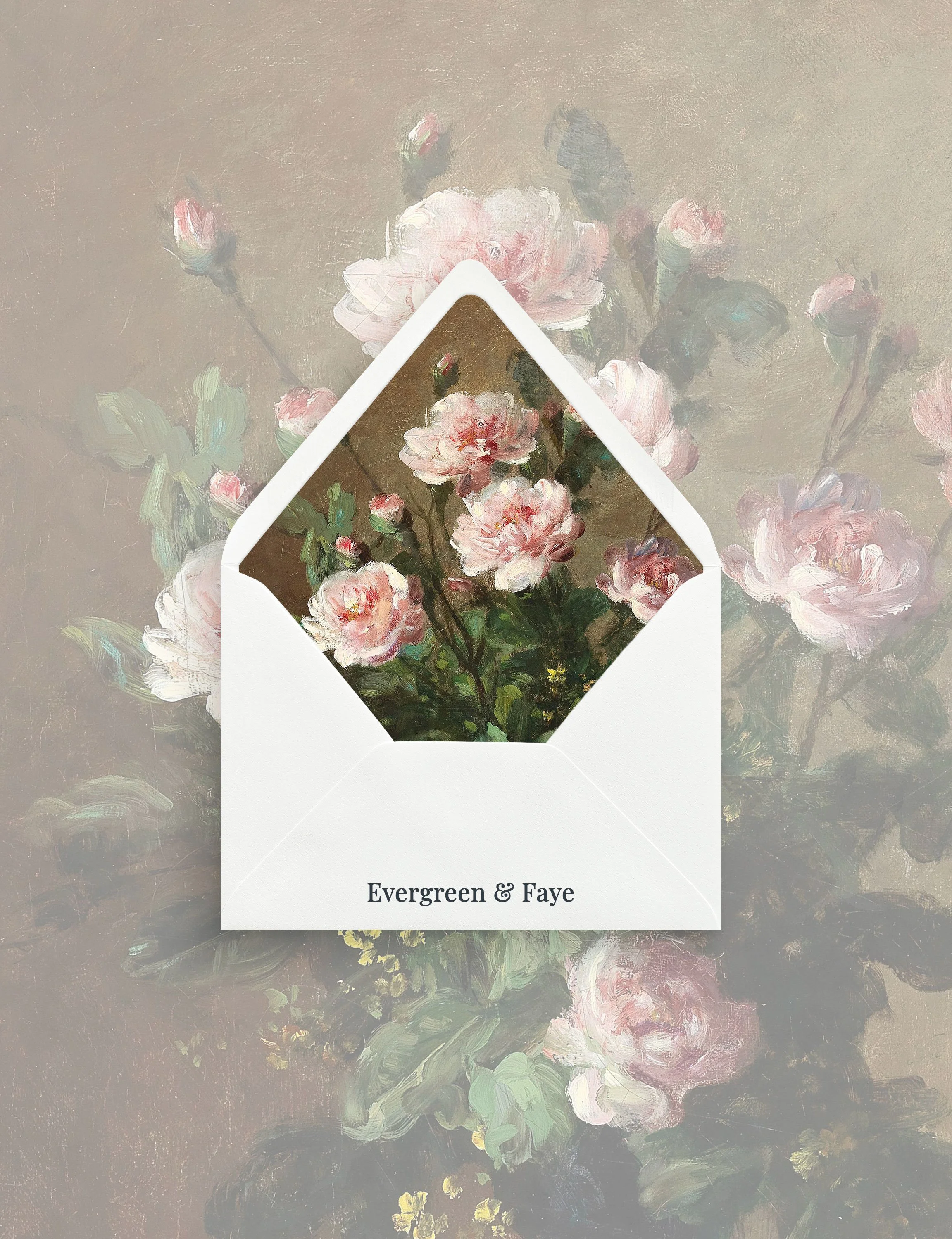
Envelope Liners
Envelope liners are available as an add-on for couples who want to create a more elevated opening experience. Liners can be chosen from our existing designs or coordinated with the artwork and colour palette of your selected suite.
vellum jackets, overlays, belly bands
choosing your options
If you are unsure which paper, print method, or colour palette is right for your suite, we are happy to guide you. During the proofing process, we can make recommendations based on your venue, season, wedding style, and the overall mood you want your invitations to create.
The goal is not simply to choose beautiful details, but to choose details that feel connected — to your wedding, your story, and the experience you want your guests to have from the very first envelope they open.
a note on samples
Samples are the best way to experience the paper, scale, colour, and print quality before placing your full order. While digital previews are helpful for reviewing layout and wording, printed samples offer the most accurate sense of texture and finish.
If you are considering an upgraded paper, letterpress, foil, or a more specific colour palette, we recommend ordering a sample or sample kit before finalizing your suite.
Let’s Work TogetherIf you're interested in working with us, complete the form with a few details about your project. We'll review your message and get back to you within 48 hours.