02 / PRINTING & PAPER GUIDE
the foundation of your story
At Evergreen & Faye, every invitation begins with the feeling of paper between your fingertips.
Thick cotton, soft deckled edges, luminous print finishes — each detail sets the tone for the celebration you’re inviting your guests into.
This guide walks you through the materials and methods we use to craft modern heirloom stationery
Premium Digital
-
Our premium digital printing option offers a flawless finish with vibrant, true-to-life colours that bring your designs to life. This high-quality, professional-grade printing process ensures each detail is captured with precision, from subtle textures to bold, striking elements. Our premium digital printing delivers a smooth, matte finish that is both elegant and durable.
-
This method is cost-effective yet elegant, making it perfect for modern wedding invitations. It allows for rich colour depth and detailed designs without the added expense of letterpress or foil stamping. The result is sophisticated, high-resolution stationery that feels timeless yet refreshingly contemporary, making it ideal for couples looking to impress with a refined aesthetic.
PRINTING OPTIONS
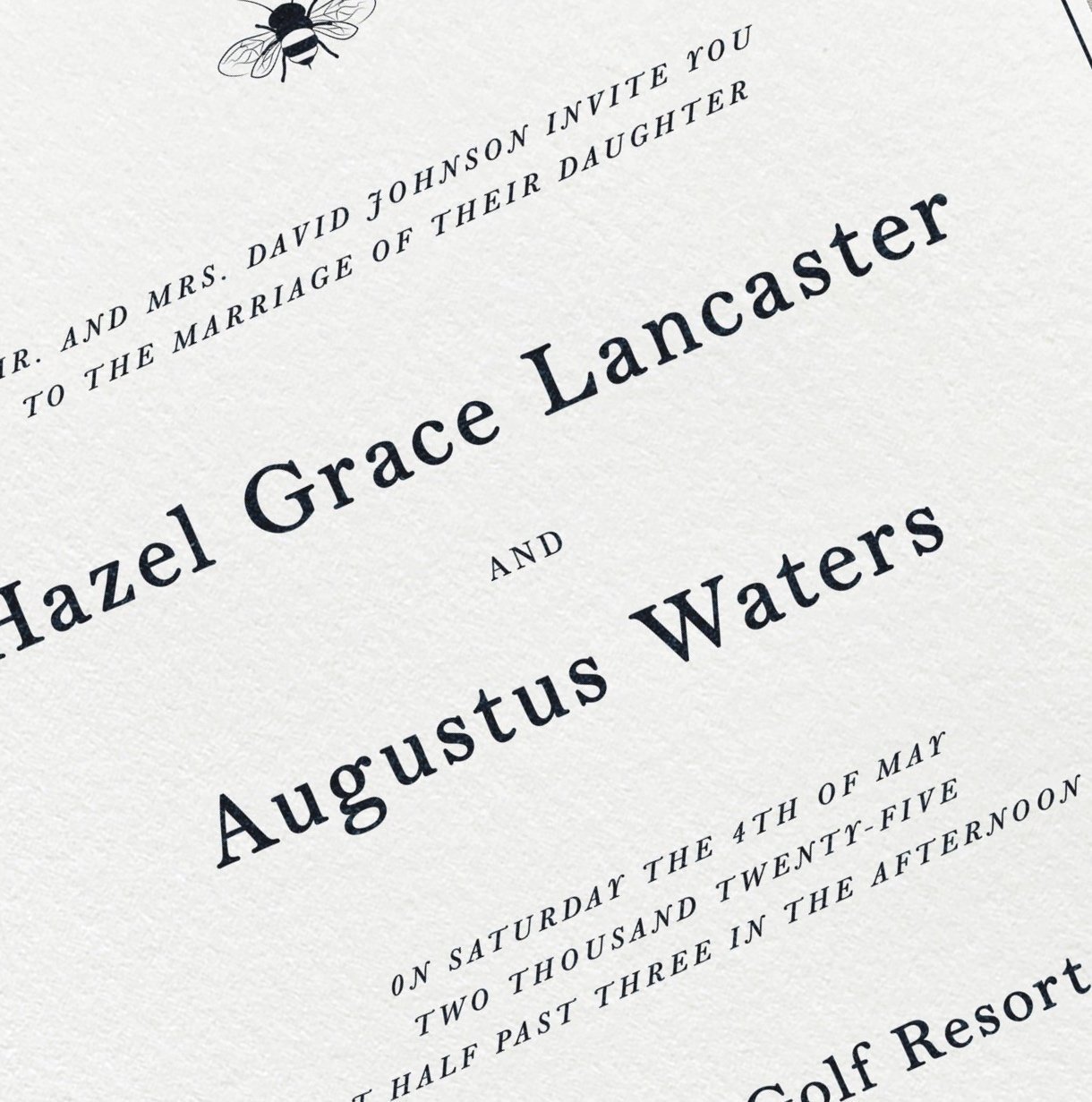
Letterpress
-
Letterpress is a traditional, handcrafted printing method where designs are pressed into thick, luxurious paper, creating a tactile, timeless feel that's rich with elegance and charm. The soft texture and depth make your invitations not just something to see, but something to feel, adding an old-world romance to every touch.
-
Letterpress is perfect for couples who love timeless sophistication and want their stationery to have a rich texture and depth. Ideal for minimalist designs, it enhances the beauty of fine typography and adds a touch of understated luxury.
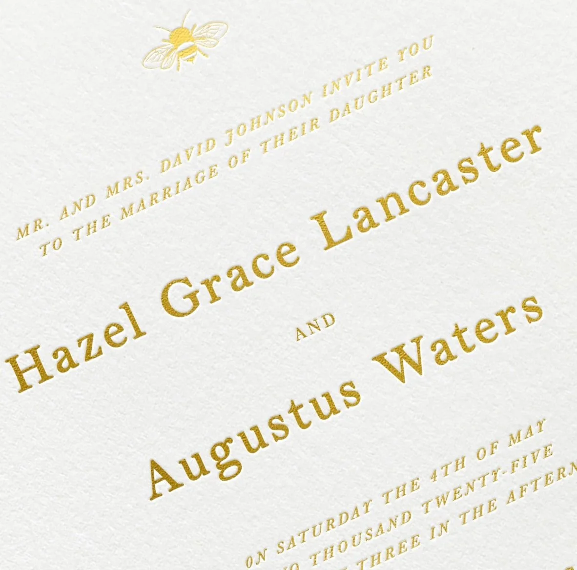
Foil Stamping
-
Foil stamping is a specialty printing technique where metallic foil is heat-pressed onto paper, creating a shimmering, reflective effect. Available in gold, silver, rose gold, and other luxe finishes, it adds a luminous touch to any design.
-
Foil stamping is the ultimate choice for couples who want a bold, glamorous, or modern look. It elevates invitations with eye-catching elegance, making details like monograms and calligraphy truly shine. Perfect for evening weddings or opulent themes.
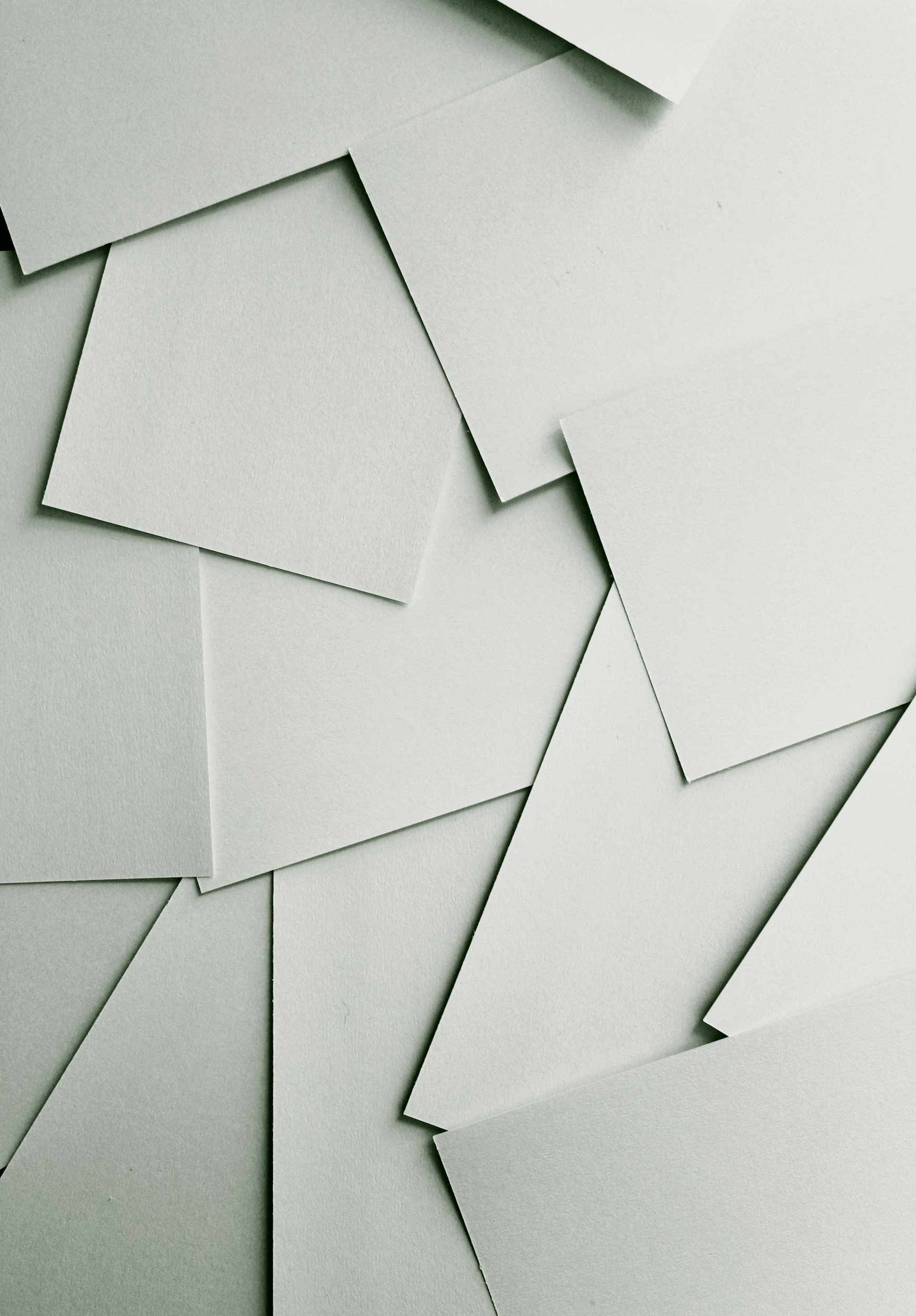
For your stationery suite, we offer the luxurious touch of 100% cotton paper in two beautiful weights and shades.
118lb: Light yet sturdy, this paper has a soft, refined texture that feels delicate to the touch while offering perfect durability. Ideal for those who love elegance with a subtle, airy feel.
236lb: For a more substantial, luxe feel, the 236lb option offers a thicker, more weighty presence, perfect for creating a lasting impression.
PAPER OPTIONS
Both weights are available in two dreamy shades:
Natural White: A soft, warm white that feels timeless and romantic, perfect for a gentle, elegant aesthetic.
Brilliant White: A crisp, bright white that exudes modern sophistication, making your designs pop with clarity and grace.
These paper options will bring a sense of elegance and romance to every invitation, ensuring that your suite feels as special as your love story.
We also offer a range of handmade paper. These papers look beautiful with letterpress or foil printing and come in a variety of colours.
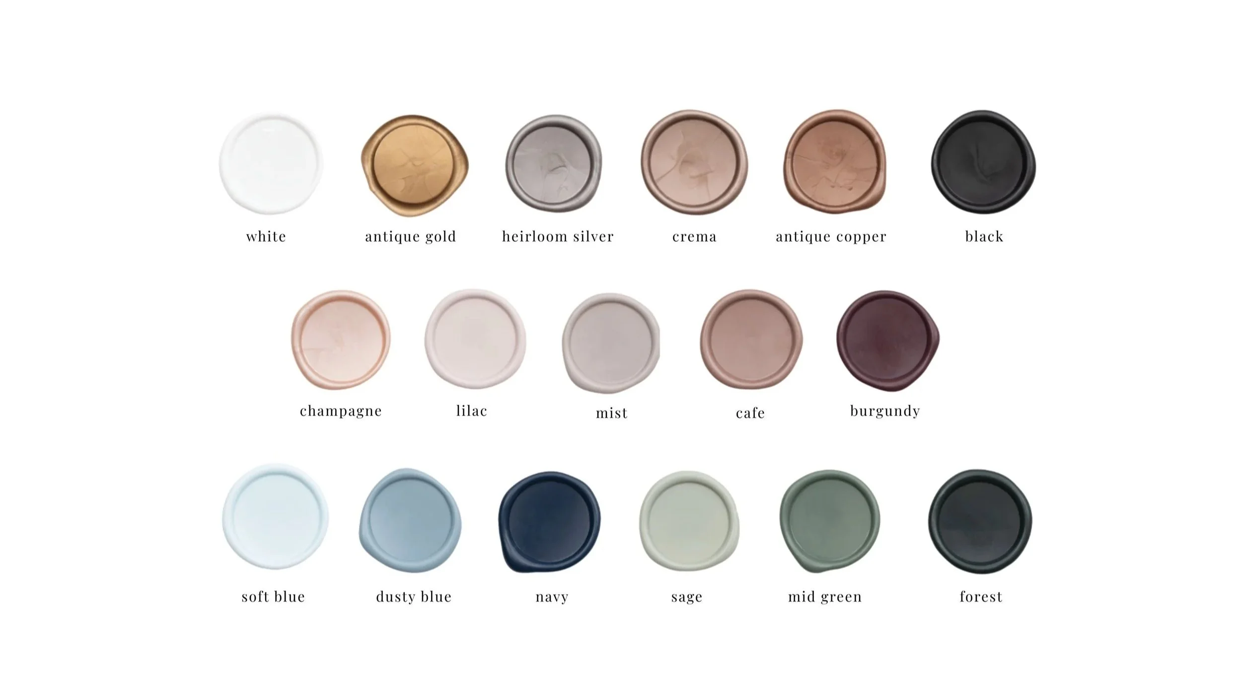
Ink Selection
Please note: While we do our best to accurately represent colours in our images, colours may appear differently from screen to screen and from screen to in person. Why does this happen?
01 / Screen vs. Print Colour Modes: Digital screens display colours in RGB (Red, Green, Blue), which uses light to create vibrant hues. Printed materials use CMYK (Cyan, Magenta, Yellow, Black) or specialty inks, which blend pigments differently, sometimes leading to slight variations.
02 / Paper Type & Texture: The same ink can look different depending on the paper stock—matte, textured, or glossy papers absorb ink differently, affecting depth and vibrancy.
03 / Lighting Conditions: Colours on a screen are backlit, making them appear brighter. In real life, ink colours change based on natural vs. artificial lighting and surrounding tones.
04 / Printing Method: Letterpress, digital, and foil stamping all interact with paper in unique ways, impacting colour intensity and texture.
For the most accurate match, we recommend ordering a sample box to see colours in person before finalizing your stationery! 💌